By Aliaksandra Tsiatserkina, maps – by Kontur’s team
Originally launched in 2019 by Topi Tjukanov, the #30DayMapChallenge has become a source of inspiration for the cartography and geospatial communities, with tens of thousands of maps shared globally. This annual event invites mappers of all skill levels to explore diverse mapping themes and showcase their creativity under the #30DayMapChallenge hashtag. Starting every November 1st, participants can engage with as many days as they choose, from a single map to a full month of contributions. The official website, 30DayMapChallenge.com, provides daily prompts, helpful resources, and an archive of inspiring maps from past challenges. Here are this year’s themes:
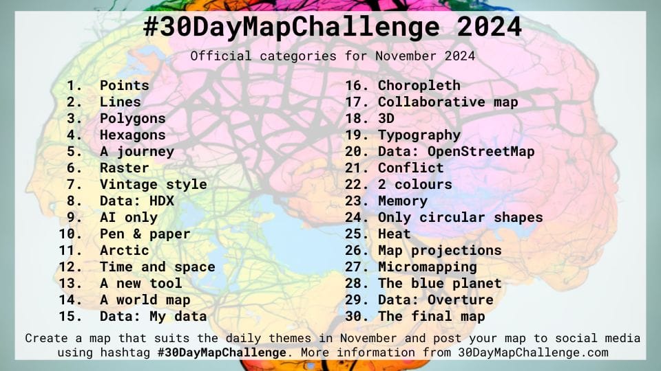
In 2024, Kontur joined the challenge for the 4th time, with 20 team members showcasing their mapping expertise across all topics, from “Points” to “The Final Map….” This year, for the first time, we shared our work on X, Linkedin, FB, Instagram, mapstodon to reach a broader audience. To explore this year’s contributions, search for the #30DayMapChallenge hashtag, or revisit our 2023 journey in the recap.
We’re excited to share the results of our journey in the #30DayMapChallenge2024:
Day 1: Points
by Aliaksandr Baranau, Front-End Engineer
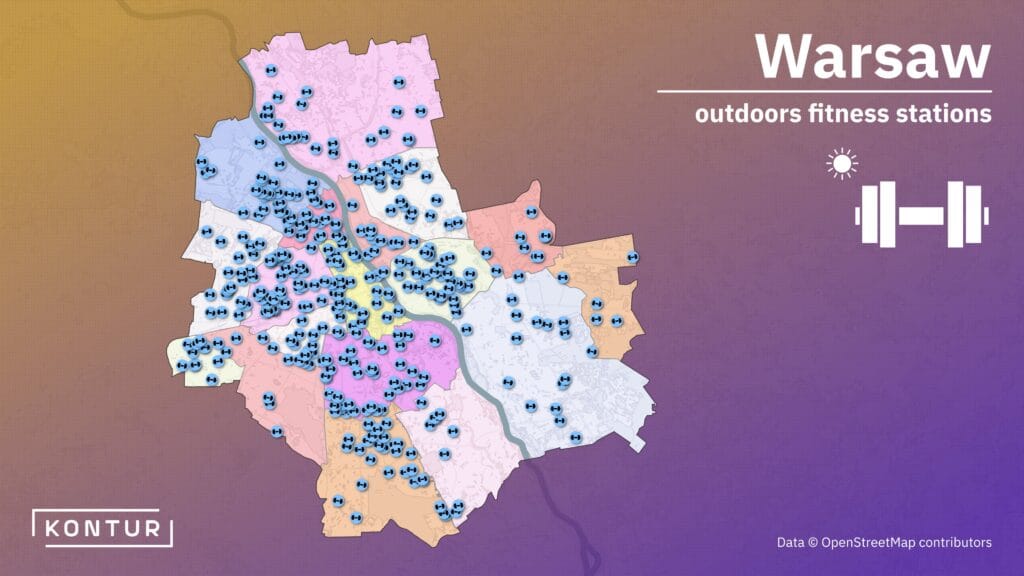
Ever wanted to exercise outside in Warsaw? This map shows which parts of the city are equipped with outdoors gyms.
Day 2: Lines
by Aliaksandra Tsiatserkina, UX Designer
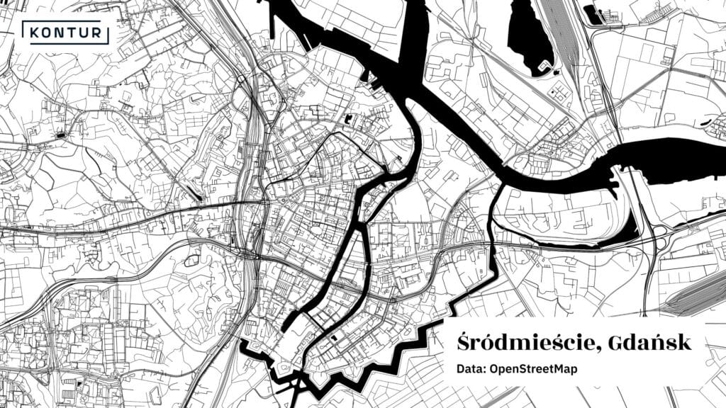
For this map of Gdańsk, voted the most beautiful city in Poland by Magazyn.travelist.pl, Aliaksandra used a minimalist approach with only lines and two colors, showcasing the intricate layout of the city center.
Day 3: Polygons
by Aliaksei Murashka, Quality Assurance Engineer
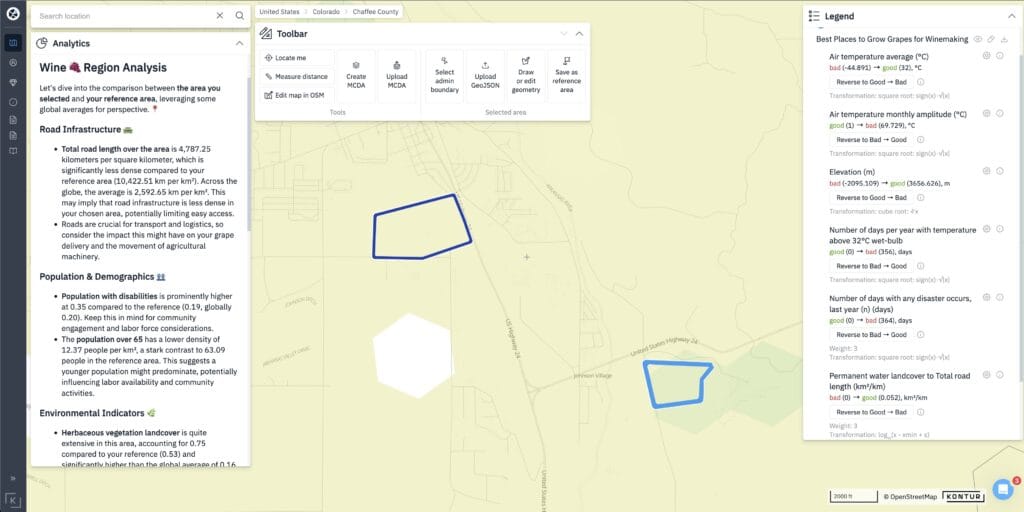
For a vineyard owner, choosing the best spot is the key to quality wine! With Kontur Atlas, we compared two areas to find the perfect one. Curious? Let’s connect!
Day 4: Hexagons
by Alesia Hil, UX Designer
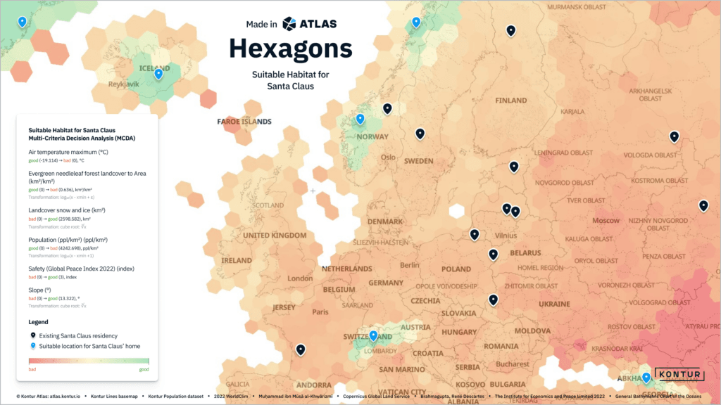
In the beginning of November, we’re already feeling the Christmas vibe. What if Santa used Kontur Atlas to find the perfect spot for his new home if he wants to relocate? Check this map to see where he might settle down this holiday season!
Day 5: A journey
by Alesia Hil, UX Designer
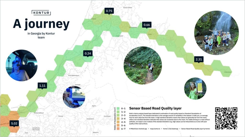
In October, the Kontur team took a trip to Mtirala from Batumi, using MilesVision app (http://github.com/konturio/live-sensors-app…) to track every bump along the way! Check out the road quality layer at http://maps.kontur.io
Day 6: Raster
by Milvari Alieva, GIS Specialist
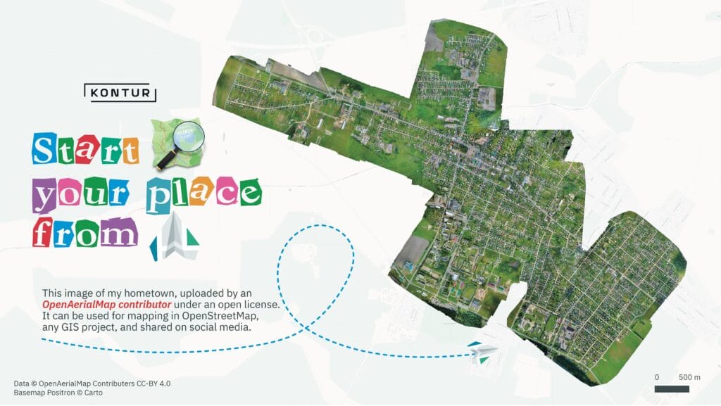
Into aerial photography but don’t know where to host your imagery?
OpenAerialMap is the best place for it! Milvari created a map to showcase this perfect solution.
Day 7: Vintage
by Aliaksandra Tsiatserkina, UX Designer
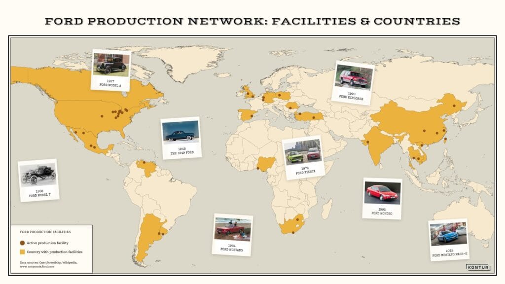
The previous century-style map highlights current Ford production facilities and the countries where they’re located. A nod to Ford’s legacy and the iconic cars that shaped it!
Day 8: HDX data
by Alexander Chichigin, Back-End Engineer
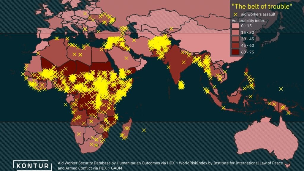
Presenting ‘The Belt of Trouble’ – a map highlighting the world’s most vulnerable countries, which also pose the greatest risk to aid workers.
Day 9: AI only
by Aksana Basalai, Marketing Specialist
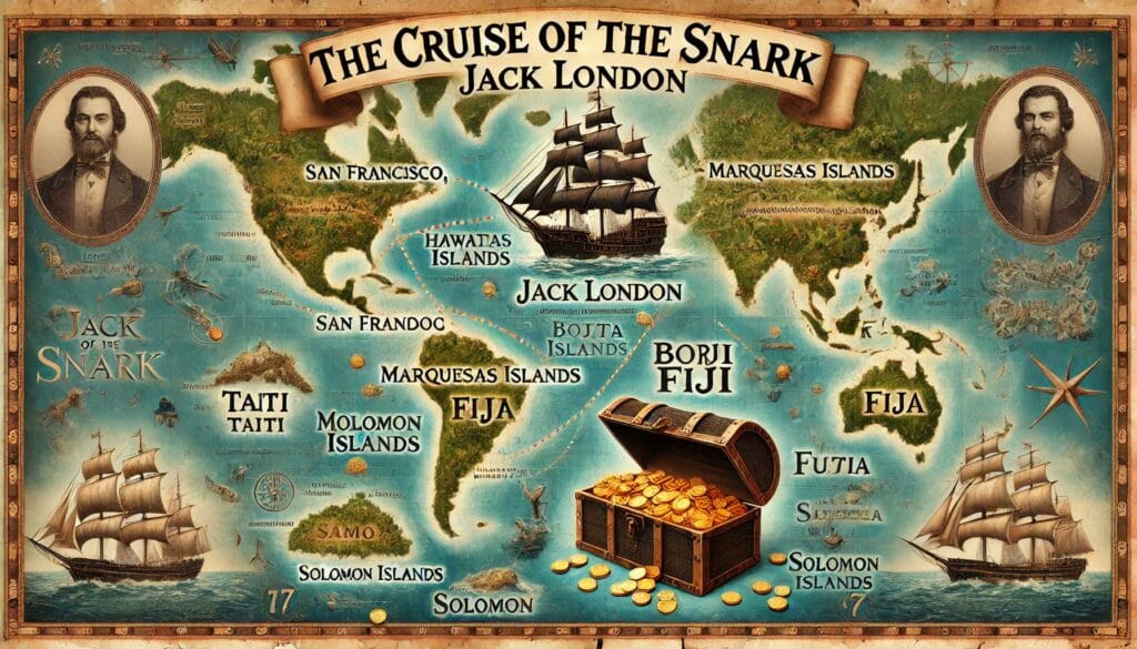
We used ChatGPT to recreate Jack London’s route from “The Cruise of the Snark”. Result? Beautiful, but far from accurate! It even ended up looking like a treasure map. Who knows – maybe AI will help us find real treasures soon! ![]()
Day 10: Pen & paper
by Darafei Praliaskouski, Head of Product Development

Our IoT sensors department leveled up this year’s Pen and Paper challenge with electronic paper and a digitizer pen to bring a map of Nuri Lake in Batumi, Georgia. Who says “Pen & Paper” can’t go high-tech?
Day 11: Arctic
by Tigran Grigoryan, Front-End Engineer
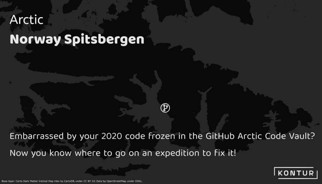
An icy adventure to the Github Arctic Code Vault in Svalbard, Norway ! A nod to the code we preserved in 2020 – now safe in the permafrost. Who’s up for revisiting some frozen commits?
Day 12: Time and Space
by Aliaksei Murashka, Quality Assurance Engineer
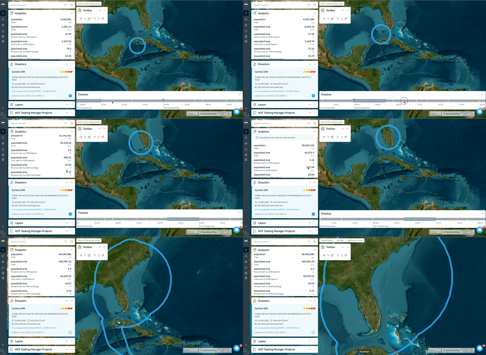
How does a disaster unfold on the map? With Kontur’s real-time analysis tools, anyone can make data-driven decisions instantly as the situation evolves. Because every minute counts.
Day 13: A new tool
by Vasili Bondar, Administrative Director
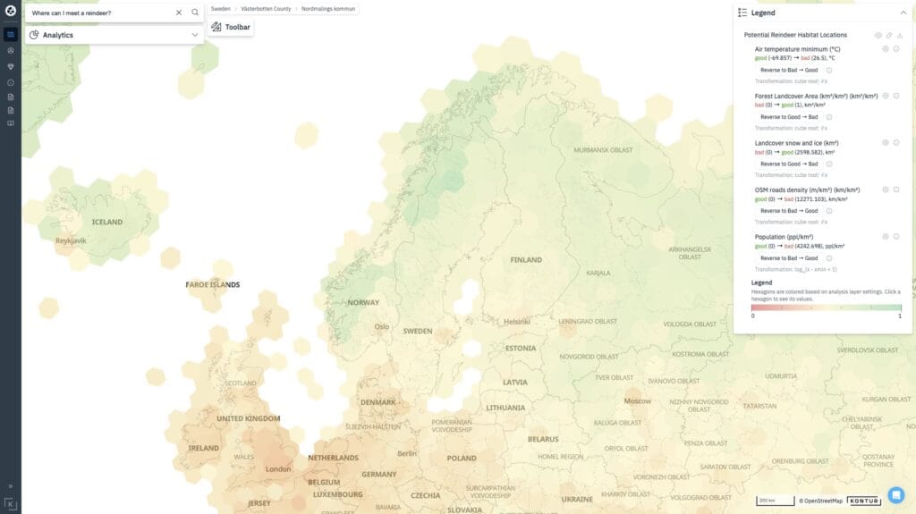
Exciting news! Kontur Atlas now has an AI – powered MCDA tool! With the holidays near, we used this feature to find Europe’s top spots to encounter reindeer in just a few seconds. Check out the results on the map!
Day 14: A world map
by Natallia Harshunova, Front-End Engineer
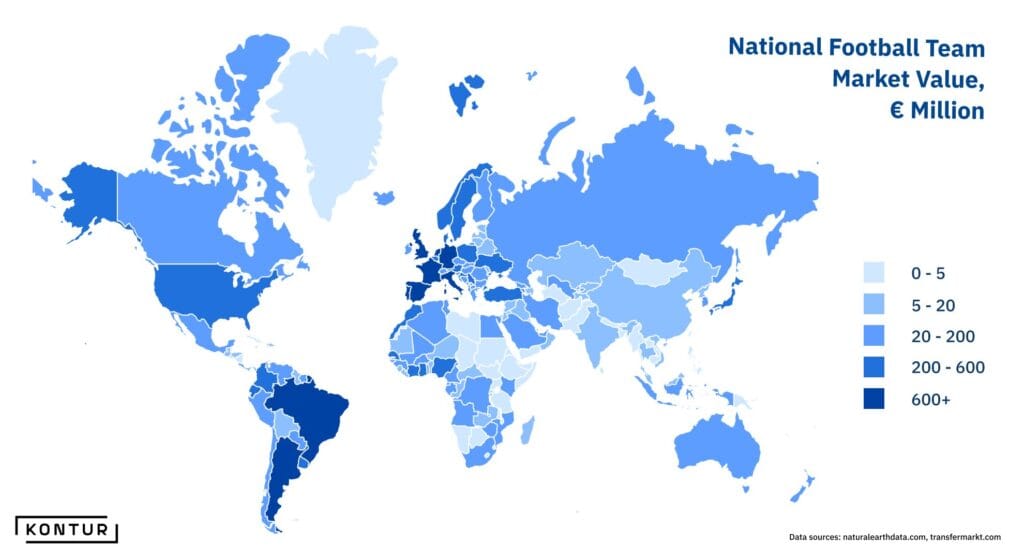
Football (aka soccer) reigns as the world’s most popular team sport, with massive budgets! This map showcases the estimated market value of national teams globally, based on the combined values of their players.
Day 15: My data
by Katiaryna Bahanko, Sales Representative
Here’s one of the ways Kontur can create data. Katiaryna ran a Half Marathon in Warsaw in September and mapped her route using the Relive app. Check out her track from this run!
Day 16: Choropleth
by Aliaksandr Baranau, Front-End Engineer
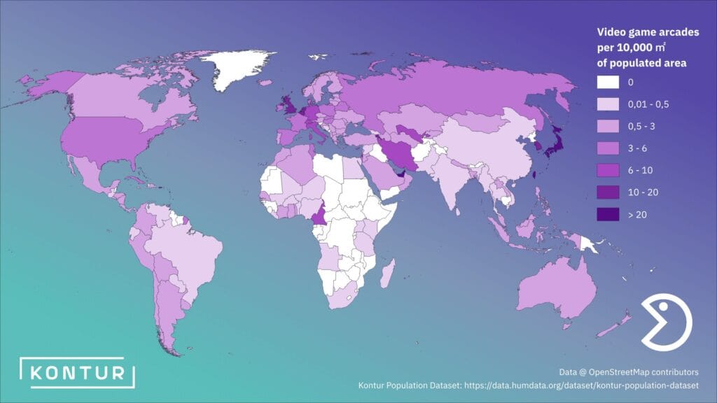
Remember video game arcades? We sure do! While they’re not as popular as they used to be, they’re making a comeback recently. This map shows which countries have the most arcades per populated area.
Day 17: Collaborative map
by Kontur team
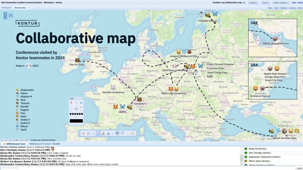
Kontur team gathered in one room at ODIN (formerly NICS) to mark events we’ve participated in with help of emojis and draw tools. See how ODIN supports dynamic teamwork and visual collaboration.
Day 18: 3D
by Darafei Praliaskouski, Head of Product Development
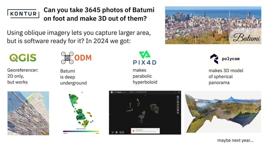
Ever tried building a 3D model of a city with no drones or aerial imagery? We did it in Batumi ! With the help of QGIS, OpenDroneMap, Polycam3D, and Pix4d lesson learned: photogrammetry without drones is creative chaos.
Day 19: Typography
by Aleksey Tarakanov, UX Designer
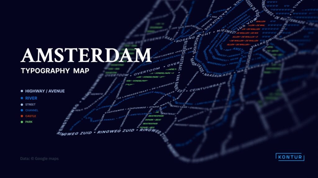
Explore Amsterdam through typography! This map reimagines the city center, turning streets, rivers, and landmarks into a stunning composition.
Day 20: OpenStreetMap data
by Alesia Hil, UX Designer
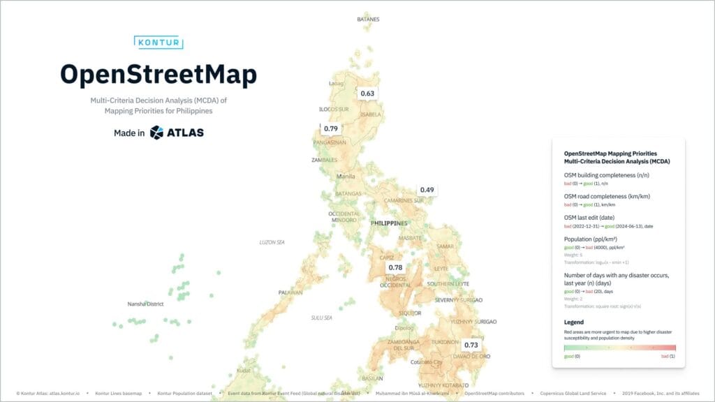
Where should mapping efforts focus at the Philippines? We analyzed OSM gaps, recent edits, past disasters, and population to identify priority areas. Powered by Kontur Atlas and our AI-driven MCDA tool!
Day 21: Conflict
by Andrei Klopau, Head of Sales
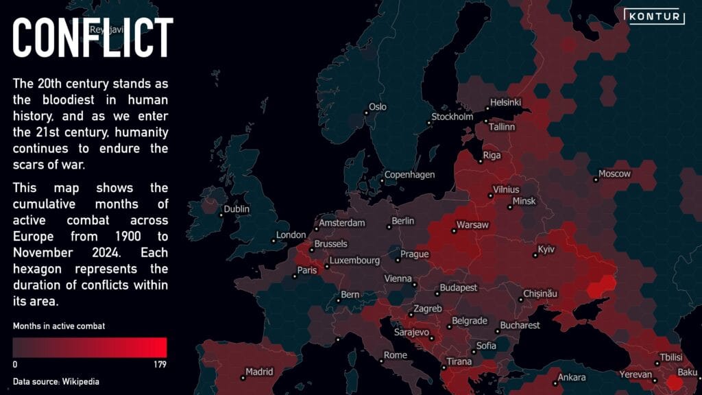
At Kontur, we often analyze natural disasters, but humanity’s greatest devastation is self-inflicted. This map highlights cumulative months each hexagon has been a frontline since 1900. Some scars, like Verdun, linger even a century later.
Day 22: 2 Colors
by Nadzeya Laptsik, Software Engineer
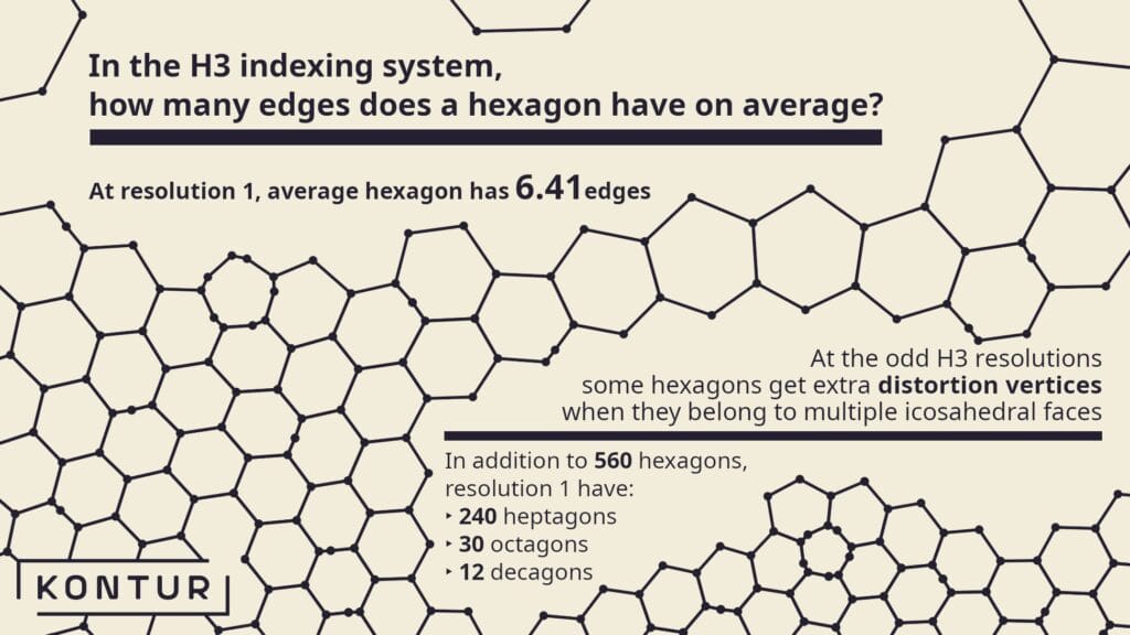
Some hexagons on Kontur maps aren’t what they seem! This map, crafted by Nadzeya, explores hexagonal oddities in just 2 colors – a statistical snapshot of the world through the lens of H3.
Day 23: Memory
by Noel Gorelick, Chief Technology Officer
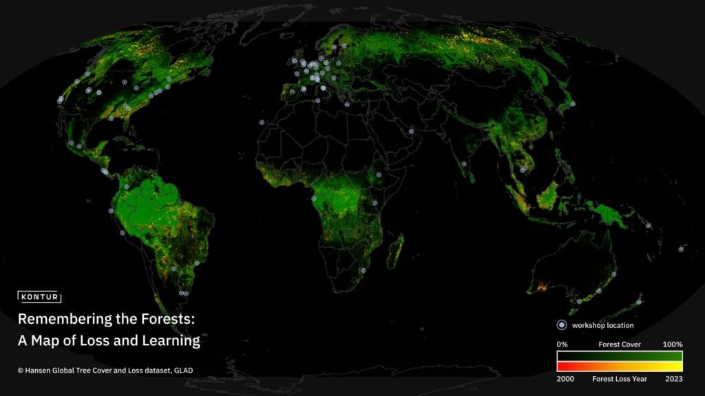
Noel, co-founder of Google Earth Engine & newest Kontur team member, combines Hansen Global Tree Cover/Loss dataset & 80+ workshop locations (from memory) that helped Earth Engine “map” its impact.
Day 24: Only circular shapes
by Tigran Grigoryan, Front-End Engineer
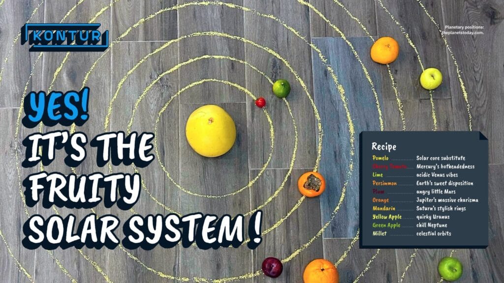
Welcome to the Fruity Solar System! A cosmic map where planets are sweet, tangy, and juicy. If you ever need the current positions of celestial bodies for your next interstellar journey, feel free to use this photo!
Day 25: Heat
by Nick Provenzano, Director of Programs & Aleksey Tarakanov, UX Designer
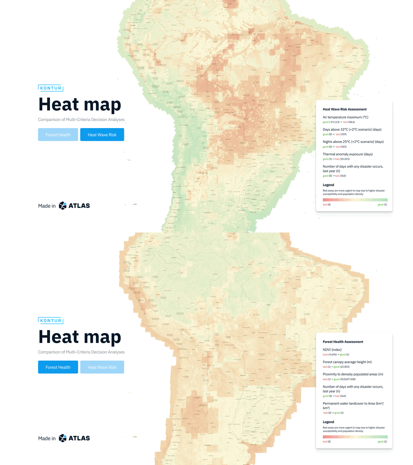
These maps compare the rising climate heat risk in the Amazon with forest health. The results show how increasing temperatures and wildfire risks are closing in, rapidly degrading this vital ecosystem. Powered by Kontur Atlas and our AI-driven MCDA tool!
Day 26: Map projections
by Alesia Hil, UX Designer
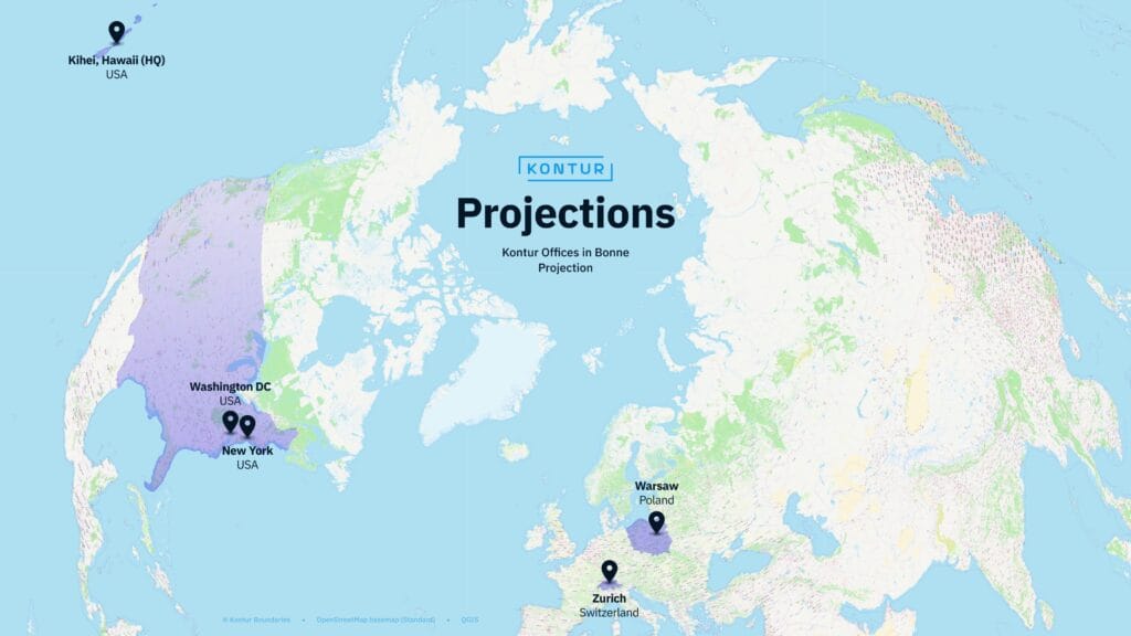
Kontur is global! This Bonne projection map shows our offices in 3 countries: USA, Switzerland, and Poland. Also, our team works worldwide and speaks 11 languages, from Polish and Belarusian to Vietnamese and Georgian!
Day 27: Micromapping
by Andrei Klopau, Head of Sales
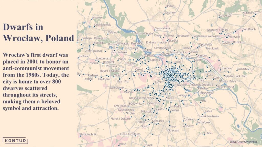
In Wrocław, Poland, tiny dwarf statues are hidden throughout the city! Installed to honor the anti-communist Orange Alternative movement, which used dwarf graffiti as a creative protest against the regime. Can you spot them all?
Day 28: The blue planet
by Andrei Valasiuk, Geospatial Data Engineer
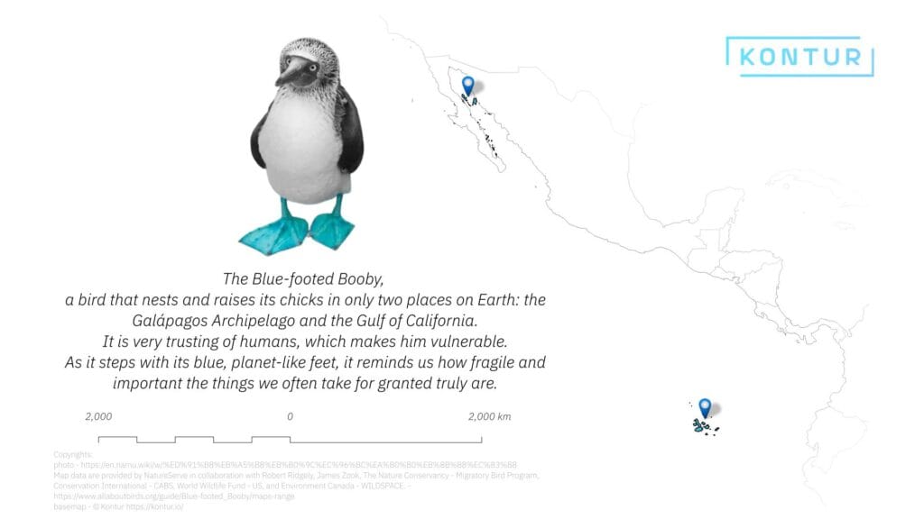
The Blue-footed Booby nests in just two places: the Galápagos and the Gulf of California. With its blue, planet-like feet, it reminds us how fragile and vital our world’s treasures truly are!
Day 29: Overture data
by Aliaksandra Tsiatserkina, UX Designer and Alexander Chichigin, Back-End Engineer
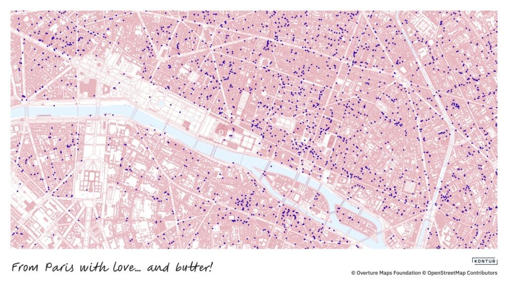
We extracted cafés, restaurants, bakeries, roads, and buildings of Paris from Overture Maps to create a postcard-style map showing where you can definitely try a croissant . Ready to send!
Day 30: The final map
by Anastasia Artyukevich, Delivery Manager
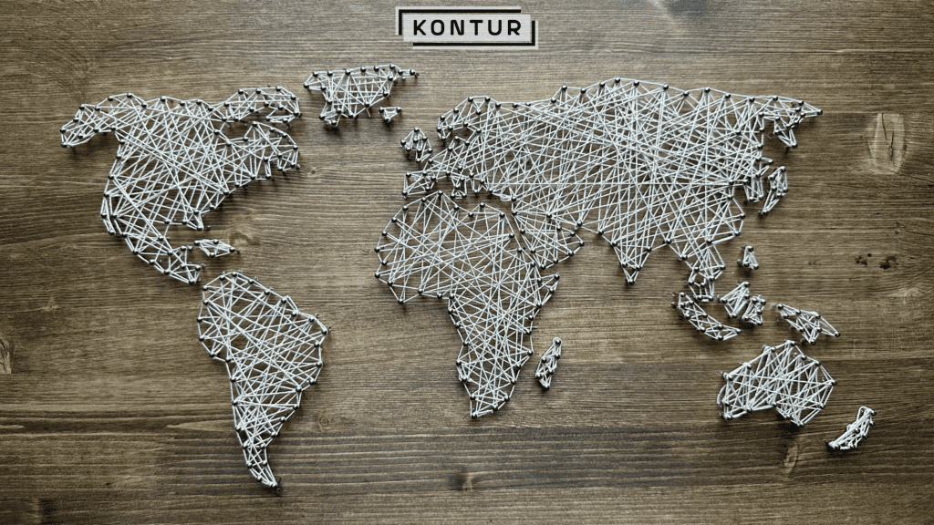
When you work at Kontur, even your art is geospatial. Tied together the world, one nail at a time.

