Atlas login
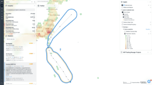
In late July 2024, we officially launched Atlas — a tool designed to help you make important decisions using maps and data, like choosing a new store location or analyzing environmental sustainability. This product is especially important to us because, while we usually create systems for disaster management and real-time analytics, Atlas started as a tool for our team and has now become a full-featured product.
Preparing for the Launch
We were concerned about meeting user expectations. To test interest and prepare better, we described Atlas’s features on our website and opened a waitlist. We were excited to see a strong interest, with hundreds signing up. Then we invited waitlist participants for interviews to show how Atlas works and discuss possible use cases.
Interview Goals:
- Understand how users plan to use the product.
- Check if the current features are enough and identify any additional needs.
- Determine which layers are necessary to solve users’ problems.
- Validate our pricing hypotheses.
We conducted many interviews and collected valuable feedback, noting every user question. We used this feedback to refine our plans and added the most requested features in time for the official release.
More Datasets
Our interviewees work in diverse areas: education, disaster management, sustainability, aviation, humanitarian organizations and other areas. Thus they asked for a great variety of datasets necessary for their jobs. For the launch time, we have added:
- Naturalization years: The number of years needed for citizenship in different countries.
- Forest canopy height: Useful for environmental studies and forest management.
- Cultural venues: Number of cultural spots like museums and theatres.
- Monetary inflation: Data on inflation for economic analysis.
- OpenAerialMap global coverage: Access to aerial images of various areas.
- Pharmacies: Number of pharmacies in different regions.
- Hotels count: Information on the number of hotels.
- Hotel stars rating maximum: Rating of hotel comfort and quality.
- World Bank tax rate: Typical income tax rates in different countries.
And we’re not stopping here — we’re continuously adding new layers.
New Features Based on User Feedback
Real users provide surprising and insightful feedback, helping us understand which features are truly important and in demand.
Automatic Data Transformation
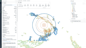
We noticed users had trouble making their analyses visually appealing. The main issue being, paradoxically, “high-contrast” data leads to low-contrast maps. So, we developed a feature that helps create clear, beautiful, and statistically justified analyses without needing to understand complex GIS details.
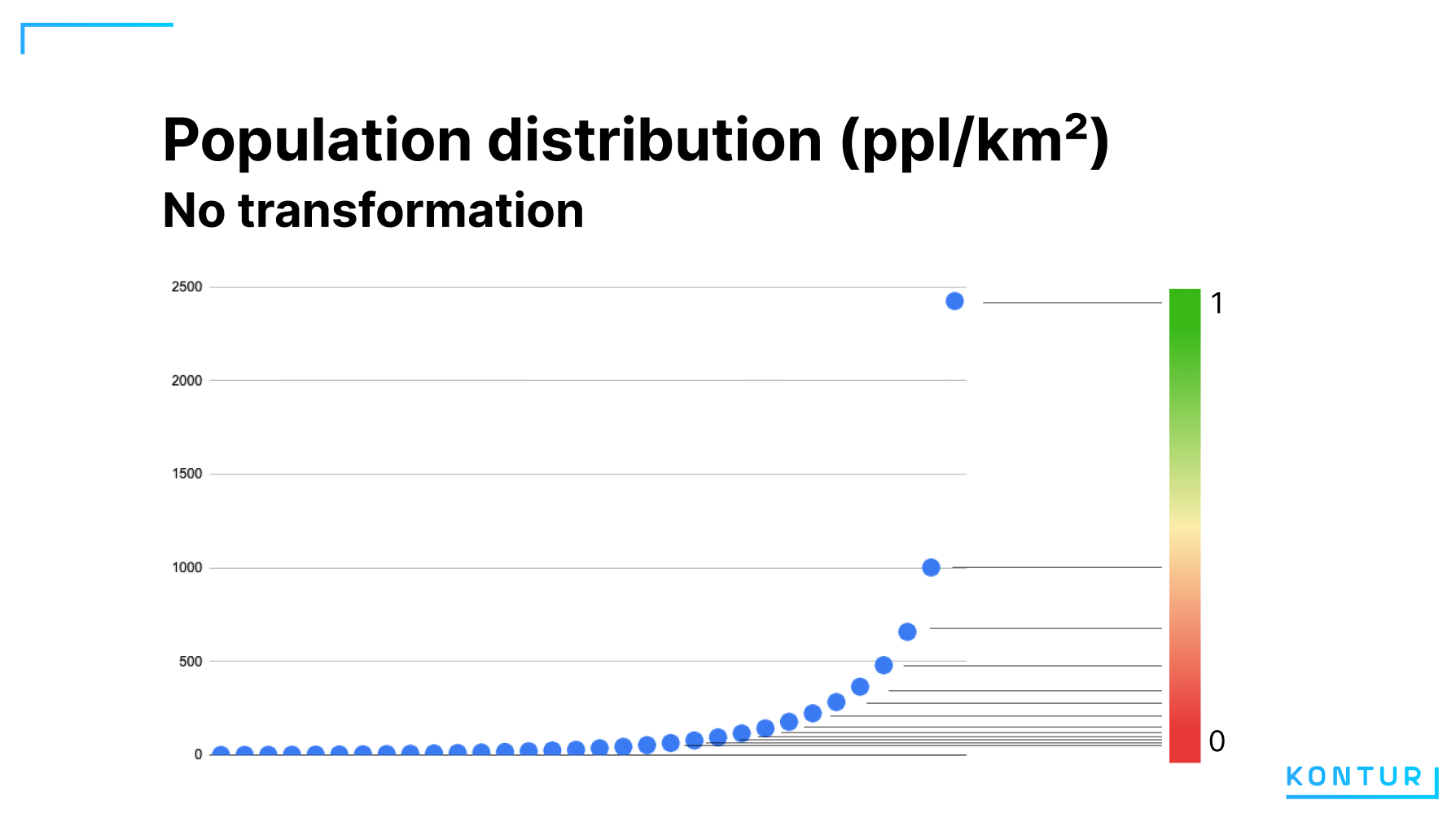
Let us explore a population density example
Population distribution shows many areas with low population and a sharp rise in cities. Such distributions can result in a map like this:
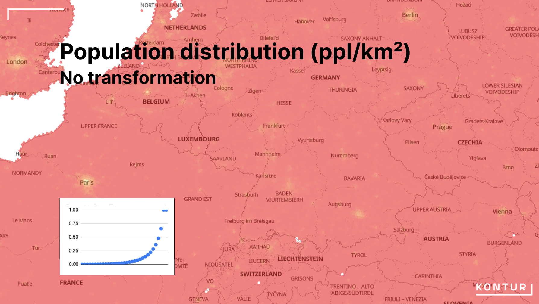
Low-contrast visualizations like this one lose a lot of information and nuance. To recover this information and make the map more contrastive, GIS specialists employ mathematical transformations that make the distribution more linear-like. Here’s an example where we transform the distribution with Log(x):
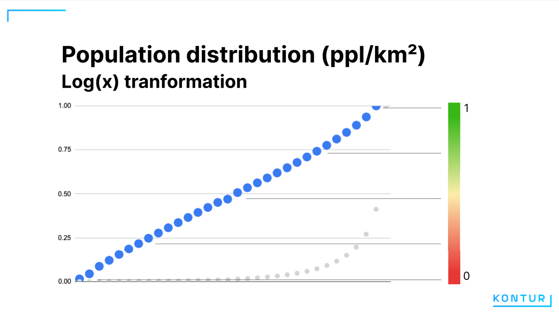
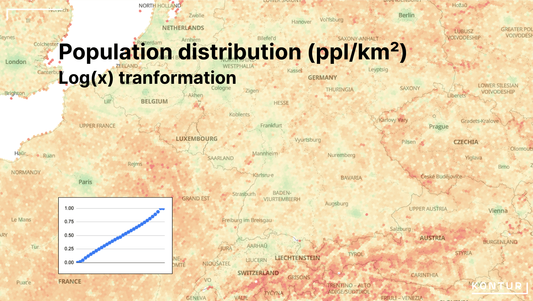
This map presents much more information, making mountains, small towns, and city outskirts distinguishable. Each layer has its own transformation function determined by the nature of the distribution. Previously, users had to do this manually for each layer. Now, Atlas automatically chooses the best transformation, making it easier to get a great analysis.
Fine-Tuning Layers
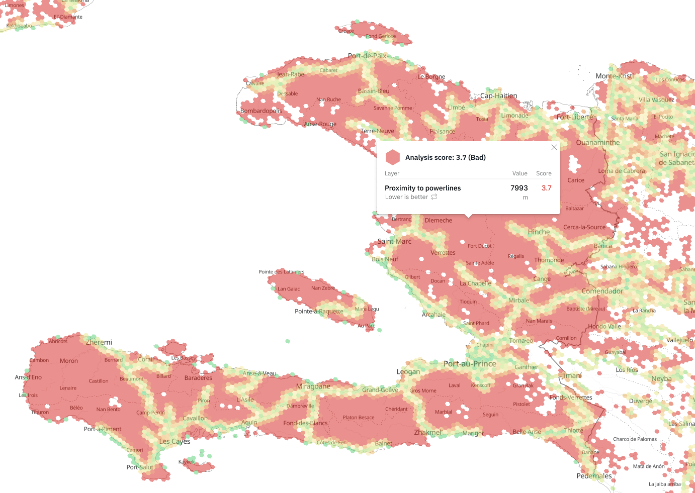
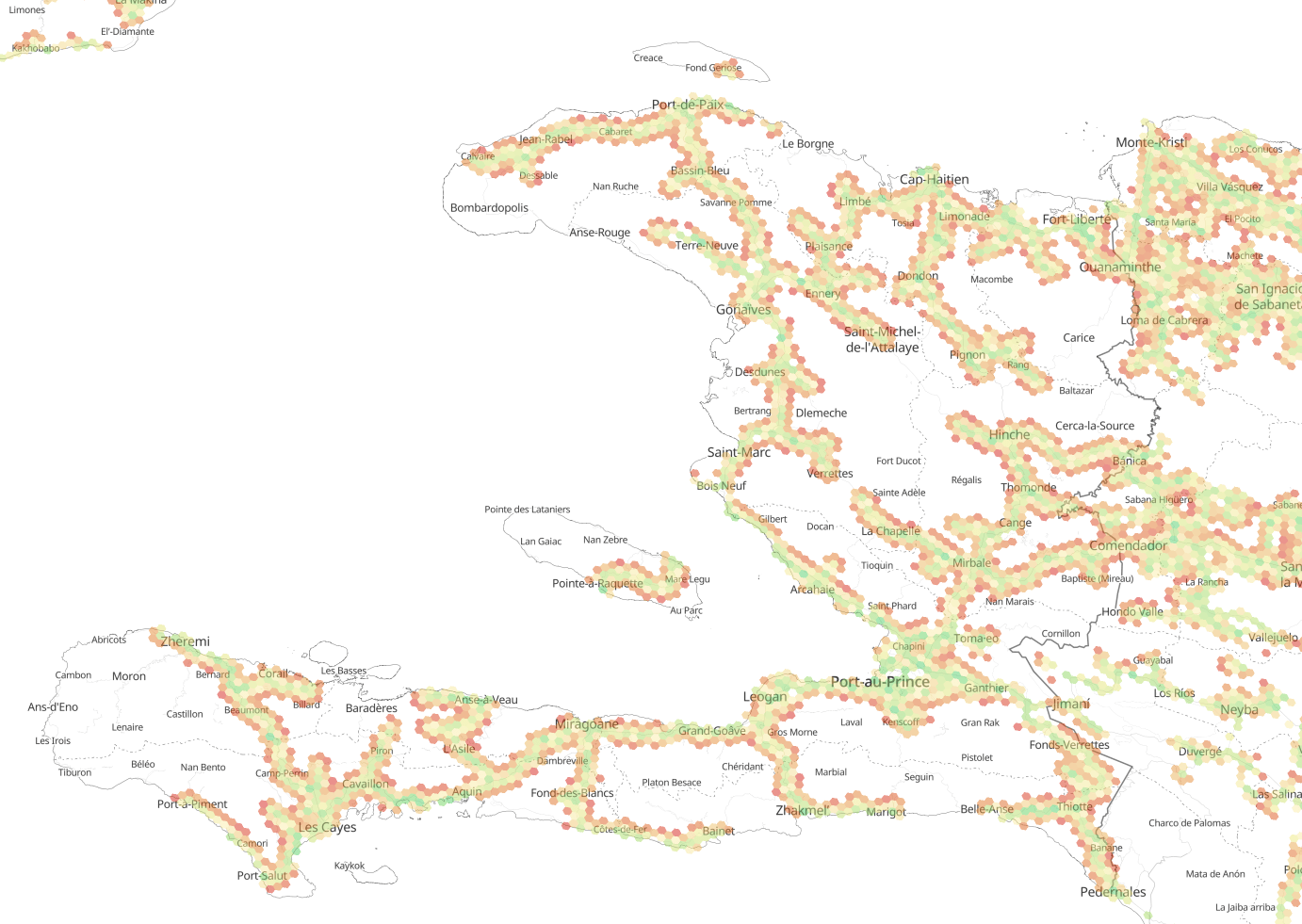
Data distribution transformations improve the clarity of the information we put on a map, but equally important what data we leave out. We’ve added several options for handling outliers to flexibly control the analysis and visualization. For example, consider the distance to power lines in Haiti from OSM data, with the upper limit set at 3000 meters, and the sentiment set that 0 is good and the longer distance is worse.

Outliers: Clamp
Meaning: Values beyond the limits contribute equally to the analysis, regardless of their distance from the limits.
Use Case: Important for finding people living farther than 3000m from power lines, without considering the exact distance.
Outliers: Don’t modify
Meaning: Contribution to the analysis increases with the distance from the acceptable limit.
Use Case: Useful when analyzing locations for building a solar station, where distances beyond the limits are still considered but involve additional costs.
Outliers: Hide
Meaning: Hexagons with values beyond the limits are excluded from the analysis.
Use Case: Useful if non-electrified areas are not considered, for example, when opening a store.
Future Improvements
We continue to enhance our tool and will soon present more detailed layer breakdowns, new search functions, and AI improvements. Thank you for your support and active participation in developing Atlas!