Atlas login
By Aliaksandra Tsiatserkina, maps – by Kontur’s team
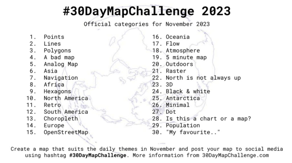
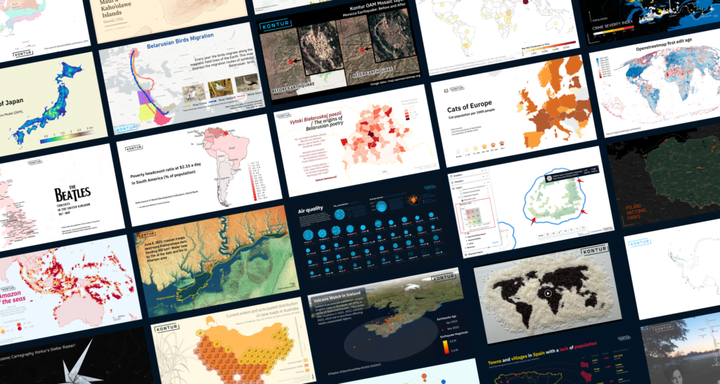
In 2023, the Kontur team once again rose to the challenge, embarking on one more journey in the 30DayMapChallenge initiated by Topi Tjukanov. This year, our team of 16 dedicated individuals came together to showcase their exceptional skills in map creation and creativity from the very first topic “Points” till the end with “My favorite…” one.
Day 1: Points
by Darafei Praliaskouski, Head of Product Development
This year we’ve started with a map which shows the location of Kontur teammates and their timezones. The azimuthal equidistant projection was one of the most suitable solutions to show this coverage.
https://x.com/KonturInc/status/1719825158272061828?s=20
Day 2: Lines
by Alexey Tarakanov, UX Designer
We can’t skip Hawaii, the place where Kontur was established, even in this year’s map challenge. Here is our way to illustrate the elevation of two islands by lines.
https://x.com/KonturInc/status/1720034845915484512?s=20
Day 3: Polygons
by Vasili Bondar, Administrative Director
Looking at the native places with a feeling of nostalgia – that’s how polygons can be helpful in this context.
https://x.com/KonturInc/status/1720382629709525432?s=20
Day 4: A bad map
by Kirill Bondarenko, Product Manager
How bad maps can be with rectangular equator? We tried to figure it out.
https://x.com/KonturInc/status/1720854198915346762?s=20
Day 5: Analog map
by Andrei Klopau, Sales Representative
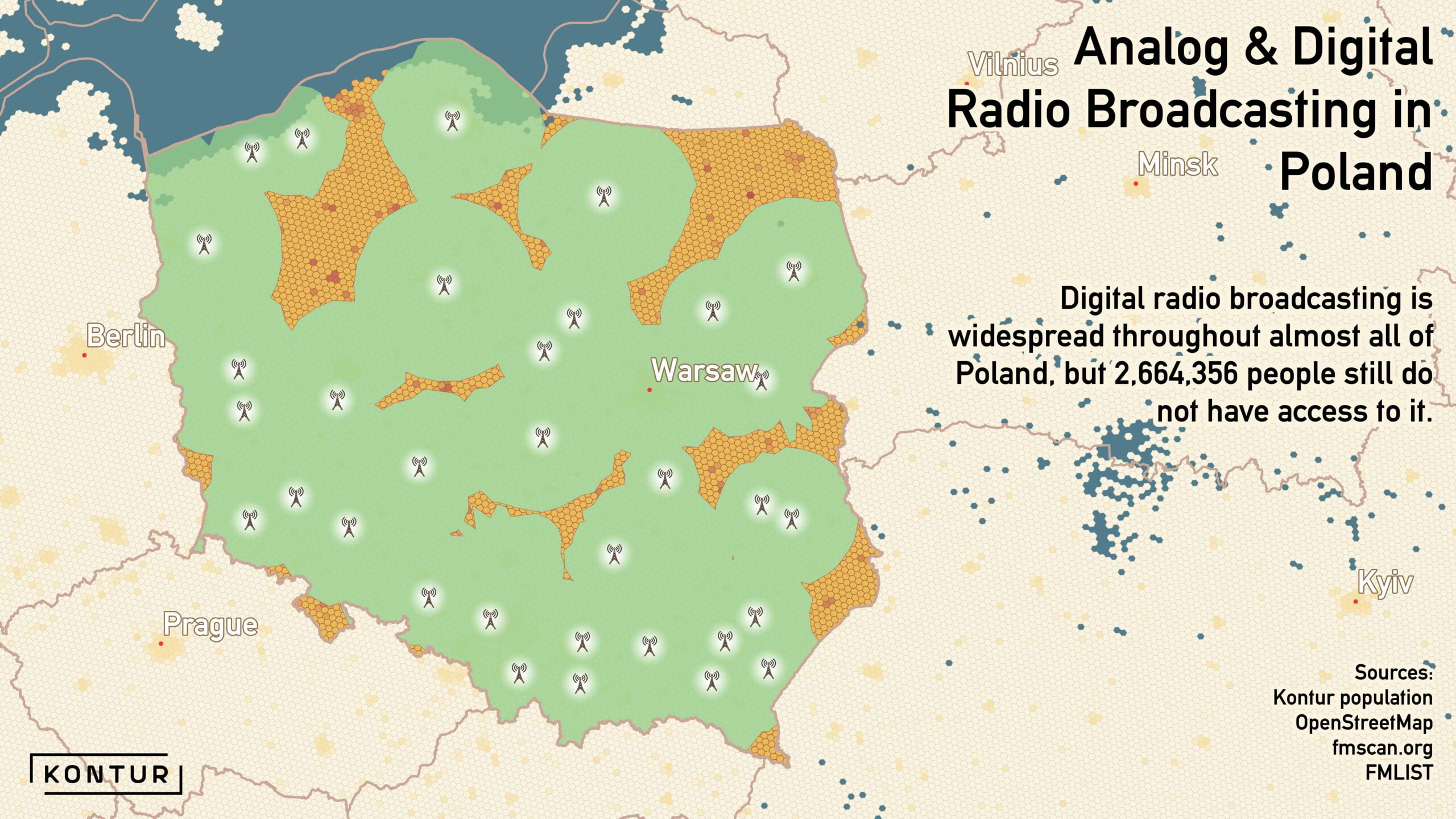
Using Kontur Population, we discovered that more than 2.5 million people don’t have access to digital radio broadcasting. No analog case for dataset usage for now.
https://x.com/KonturInc/status/1721106330109477032?s=20
Day 6: Asia
by Eugene Karpach, Infrastructure Engineer
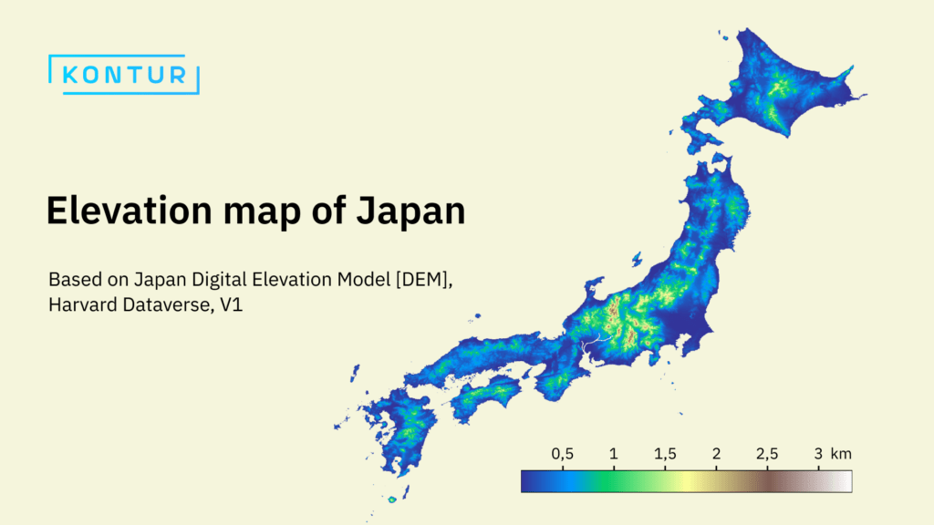
What can happen if Python, matplotlib, and rasterio are used by our engineers at once? Right – maps that look like this one.
https://x.com/KonturInc/status/1721468330538582111?s=20
by Katia Bakhanko, Sales Representative
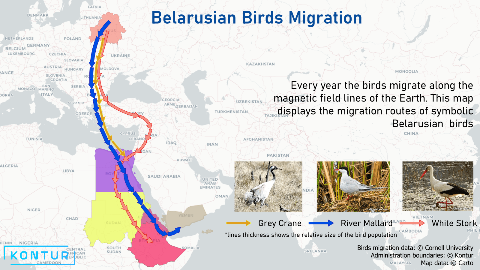
Flying to the south and back – this is the Belarusian birds’ annual activity. Not the first and not the last map dedicated to the Kontur team native place.
https://x.com/KonturInc/status/1721900015168491620?s=20
Day 8: Africa
by Aliaksei Murashka, QA Engineer
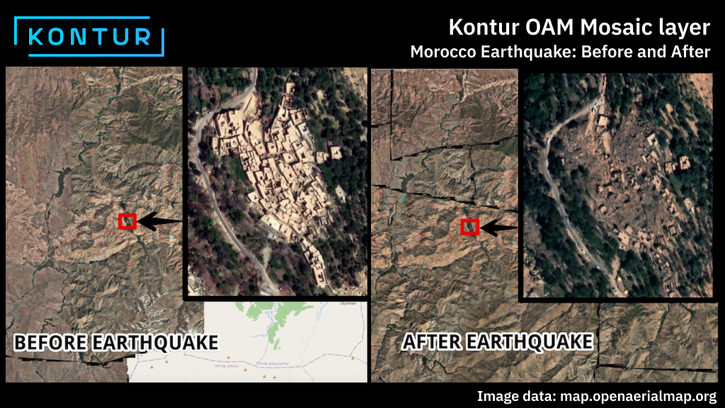
Kontur has developed a tool called OAM Global mosaic, available both on Disaster Ninja and OpenAerialMap websites, which collects all the uploaded imagery into a single layer. We decided that OAM Mosaic layer is a perfect resource for the map creation too.
https://x.com/KonturInc/status/1722172956871135547?s=20
Day 9: Hexagons
by Tigran Grigoryan, Front-end Engineer
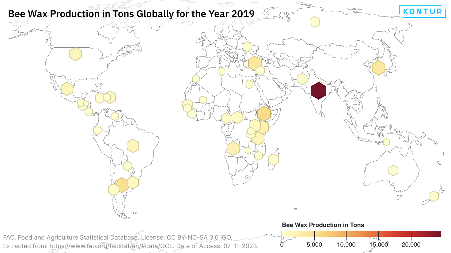
We honor the creators of the hexagonal shape, which is widely used to represent population density and other data in Kontur datasets.
https://x.com/KonturInc/status/1722578952915443834?s=20
Day 10: North America
by Alexandr Dubinin, Front-end Engineer
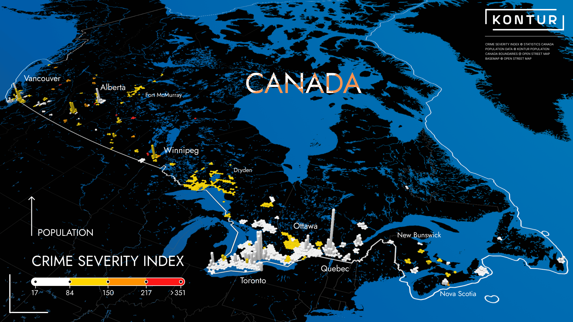
Mastering data analysis by investigating crime severity index data together with population. What if we can find the safest place on the planet, not just in Canada?
https://x.com/KonturInc/status/1722897319425634660?s=20
Day 11: Retro
by Aliaksandra Tsiatserkina, UX Designer
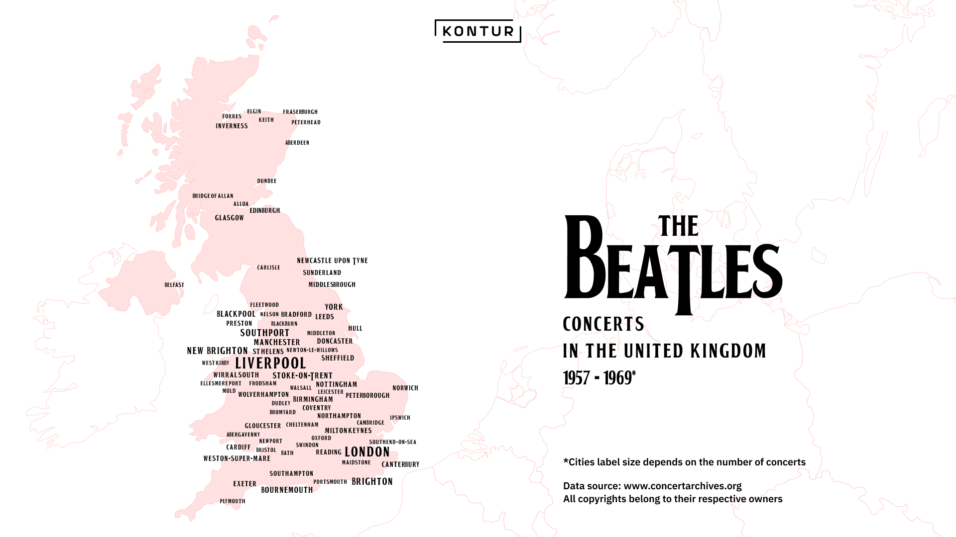
Let it be our map for the Retro topic. Inspired by new Beatles’ song release.
https://x.com/KonturInc/status/1723296775656595466?s=20
Day 12: South America
by Aliaksei Murashka, QA Engineer
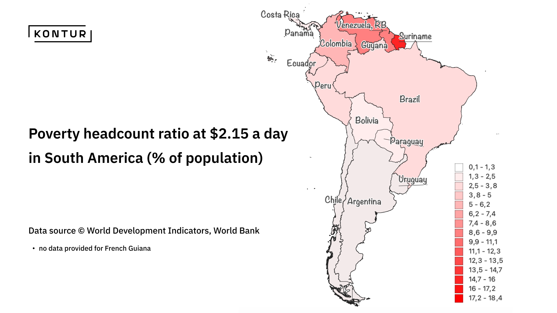
Poverty remains a critical issue in the global economy. We have utilized World Bank data to create a map that highlights the most impoverished regions in South America. On this map, the headcount ratio at $2.15 a day in South America is represented as a percentage of the population.
https://x.com/KonturInc/status/1723731325511688192?s=20
Day 13: Choropleth
by Milvari Alieva, GIS Specialist
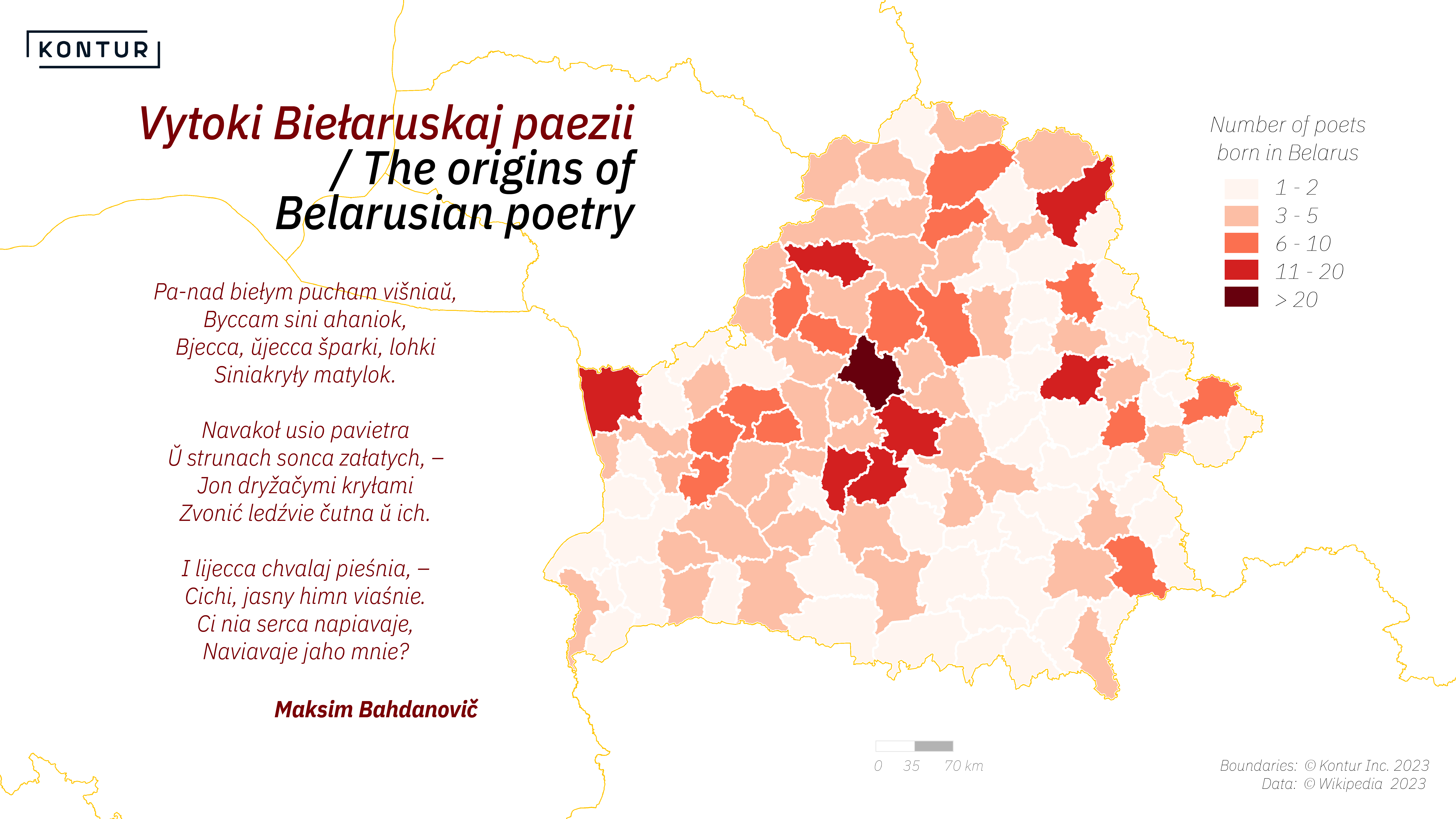
In Belarus, there are 118 administrative districts, and all of them were the place of origin for famous poets to different extents.
https://x.com/KonturInc/status/1724093802812461211?s=20
Day 14: Europe
by Aliaksandra Tsiatserkina, UX Designer
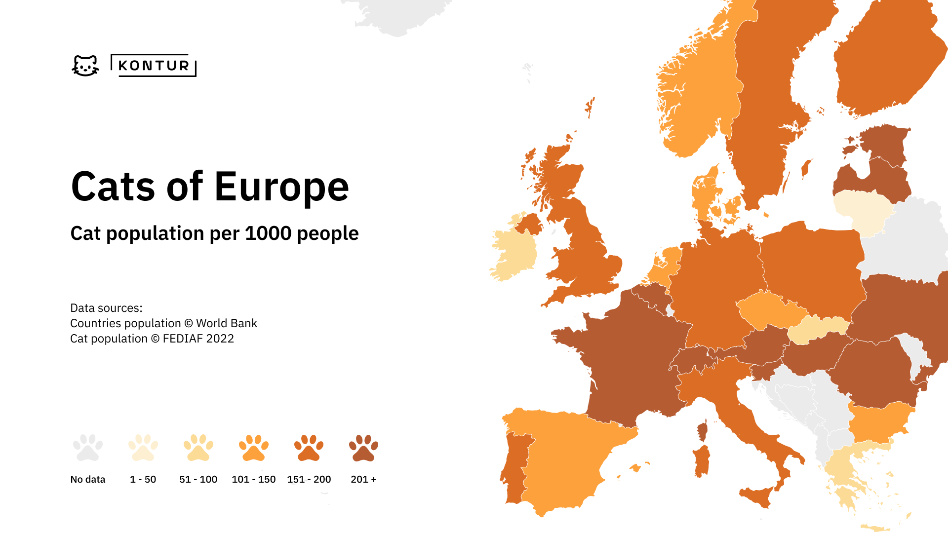
We just can’t miss the idea of making the map with or about cats this year.
https://x.com/KonturInc/status/1724388886040739954?s=20
Day 15: OpenStreetMap
by Kirill Bondarenko, Product Manager
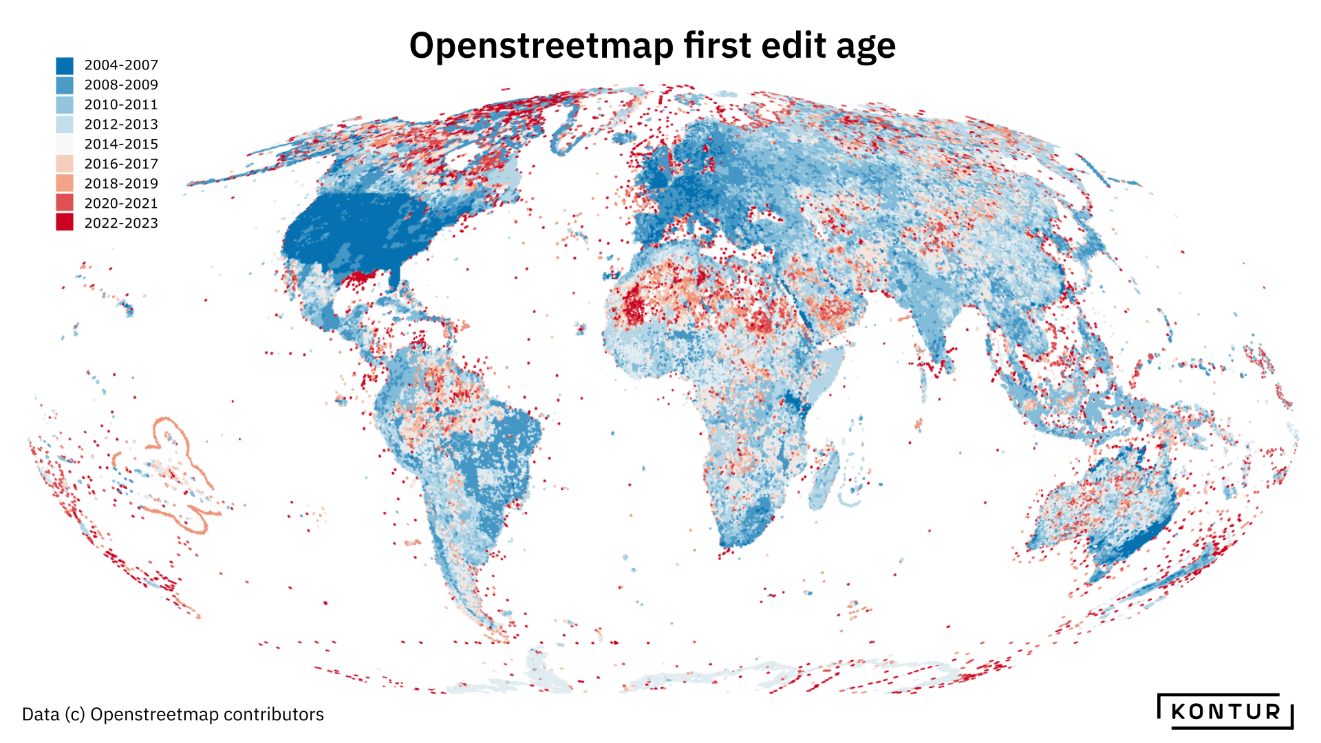
OpenStreetMap is a resource for a big number of Kontur datasets. It is a really nice idea to visualize how and where it started.
https://x.com/KonturInc/status/1724709820832366646?s=20
Day 16: Oceania
by Milvari Alieva, GIS Specialist
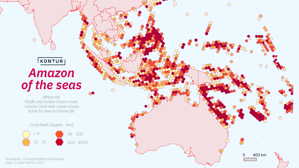
On the Kontur map, you can find the Great Reefs and Coral Triangle, located at the meeting point of two oceans.
https://x.com/KonturInc/status/1725068492460736945?s=20
Day 17: Flow
by Andrei Klopau, Sales Representative
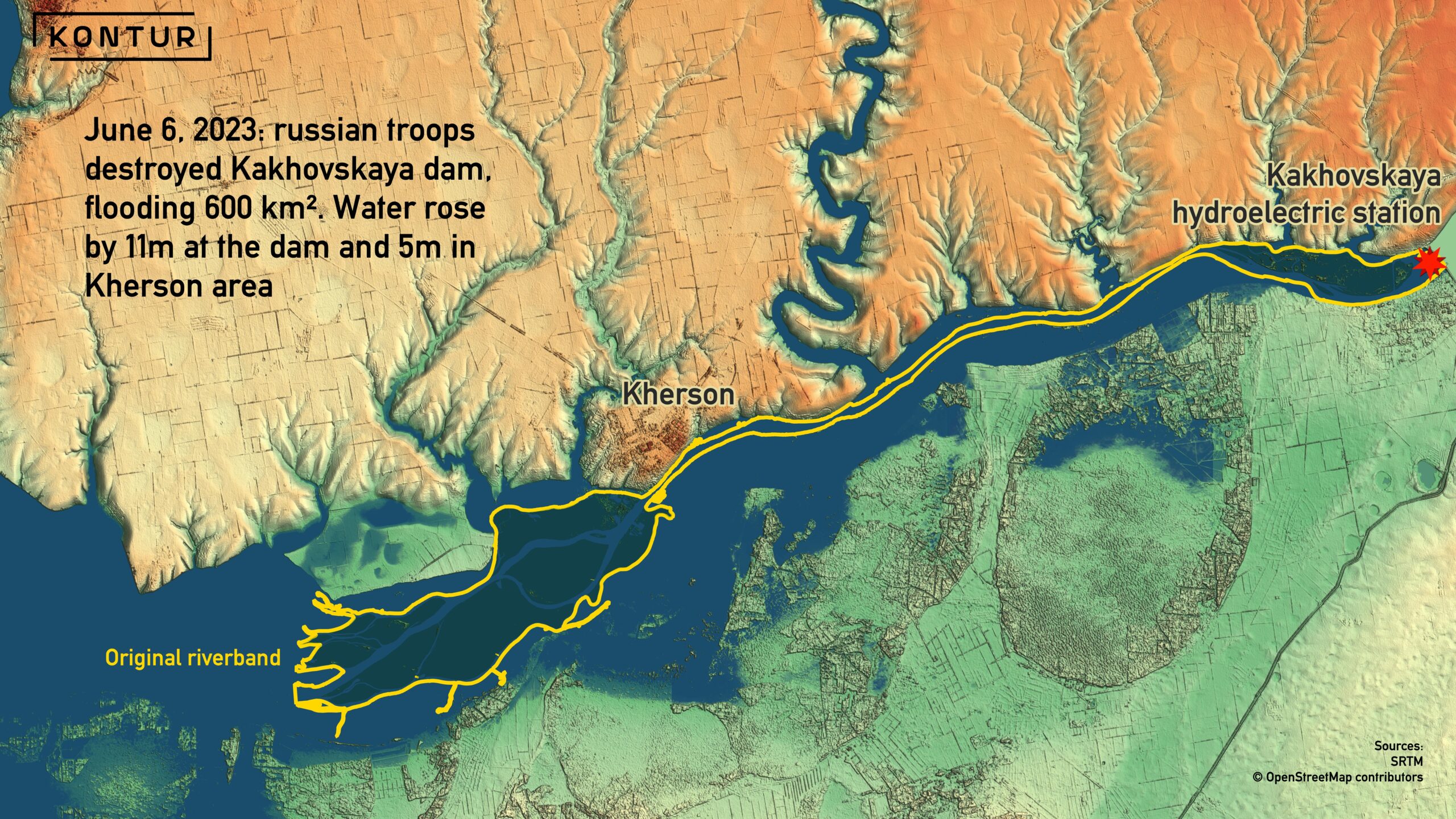
Maps can show not only the influence of anthropogenic factors, but also destructive consequences of human activities.
https://x.com/KonturInc/status/1725436432397852794?s=20
Day 18: Atmosphere
by Alexey Tarakanov, UX Designer
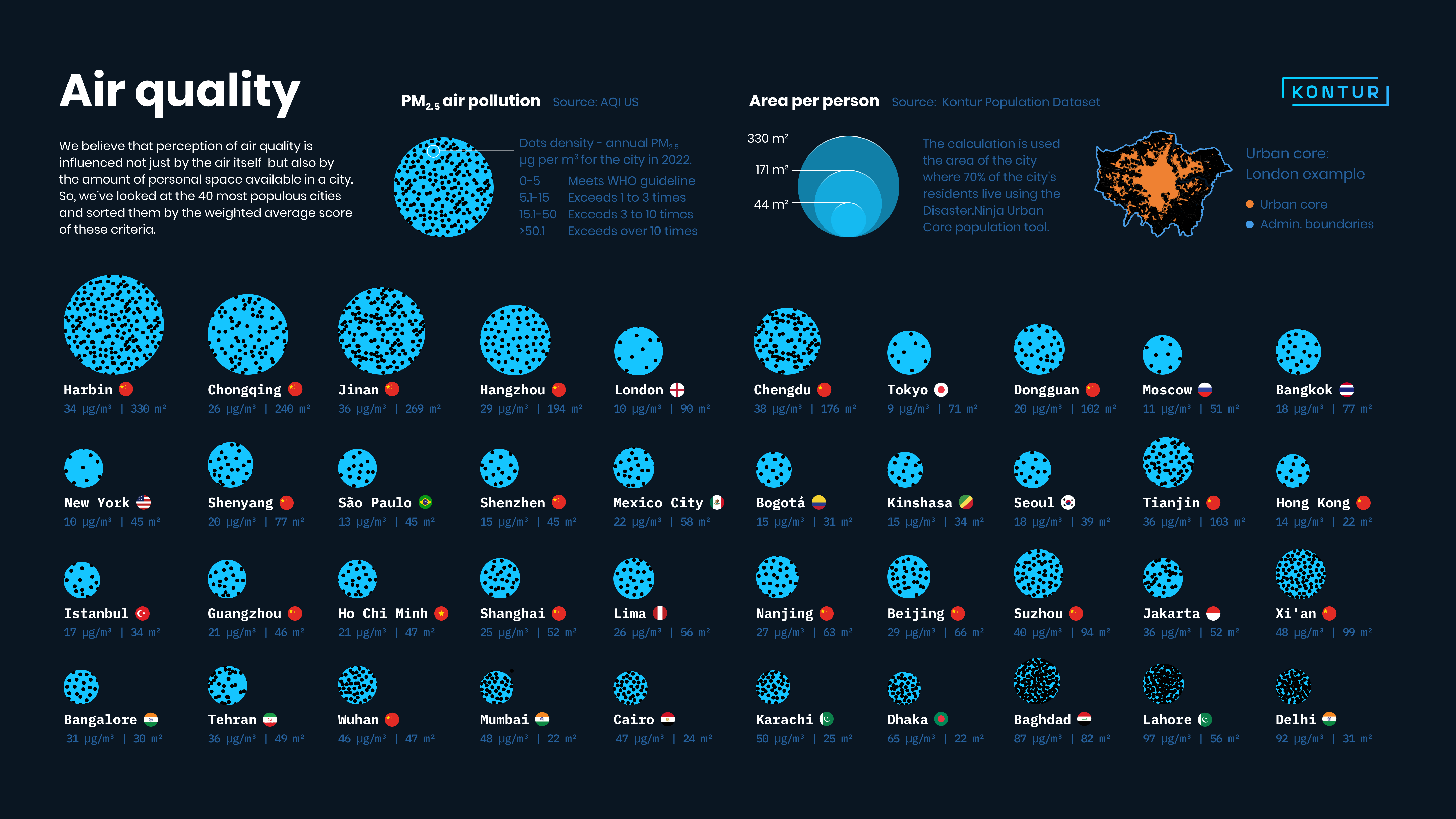
The infographic we built for this map reminds us all to care about personal space.
https://x.com/KonturInc/status/1725849318869914037?s=20
Day 19: 5 minute map
by Aliaksei Murashka, QA Engineer
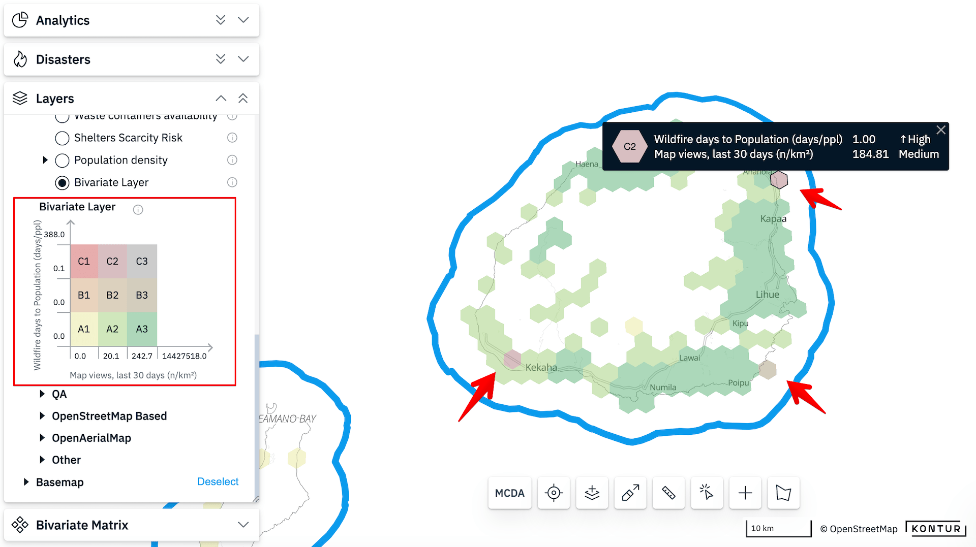
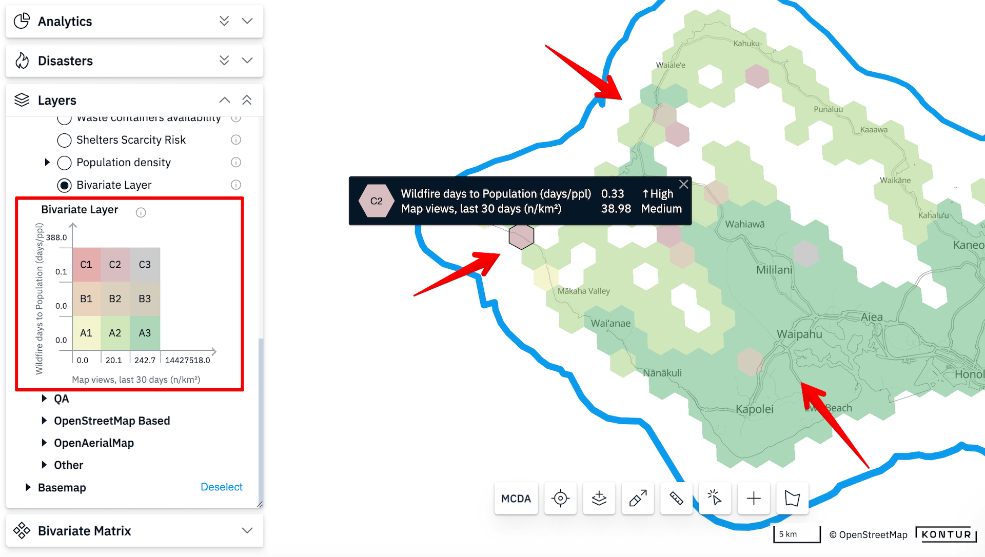
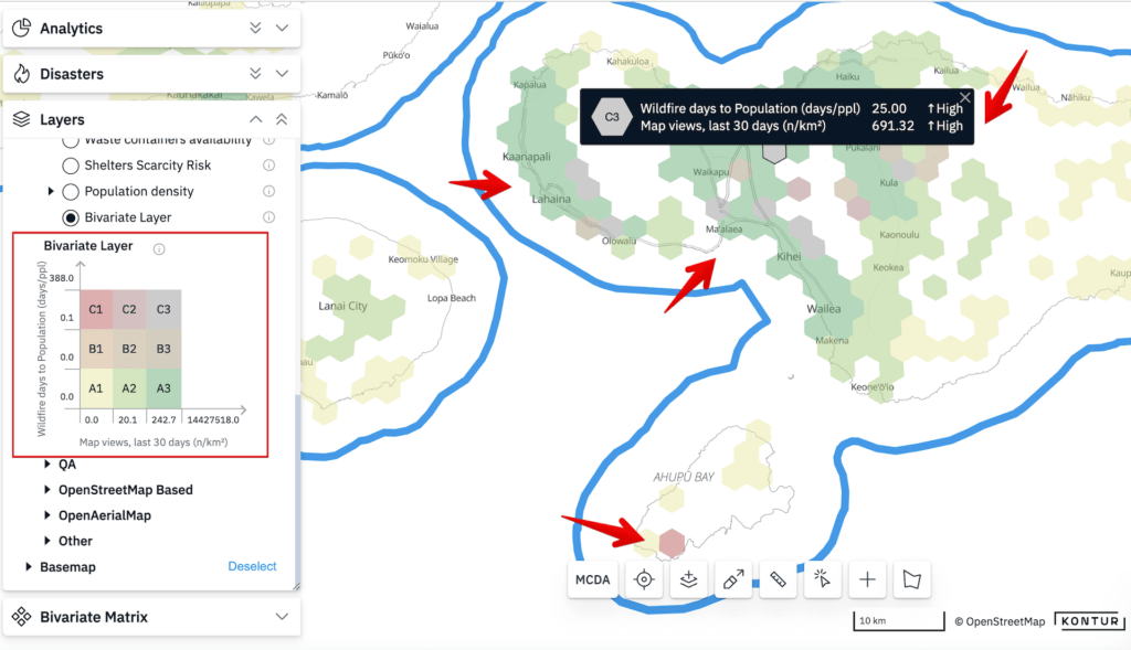
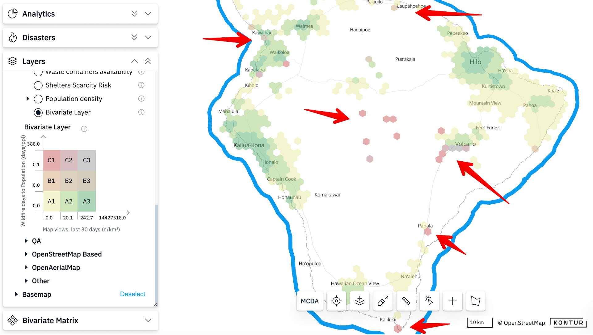
As you know, some particularly terrible wildfires took place in Hawaii. We used our own bivariate matrix tool to compare the risk of fires with the number of OSM views on one of the Hawaii islands.
Disaster Ninja is a great tool for data visualization and for quick map creation. Try it on your own!
https://x.com/KonturInc/status/1726187645934751816?s=20
Day 20: Outdoors
by Alexandr Dubinin, Front-end Engineer
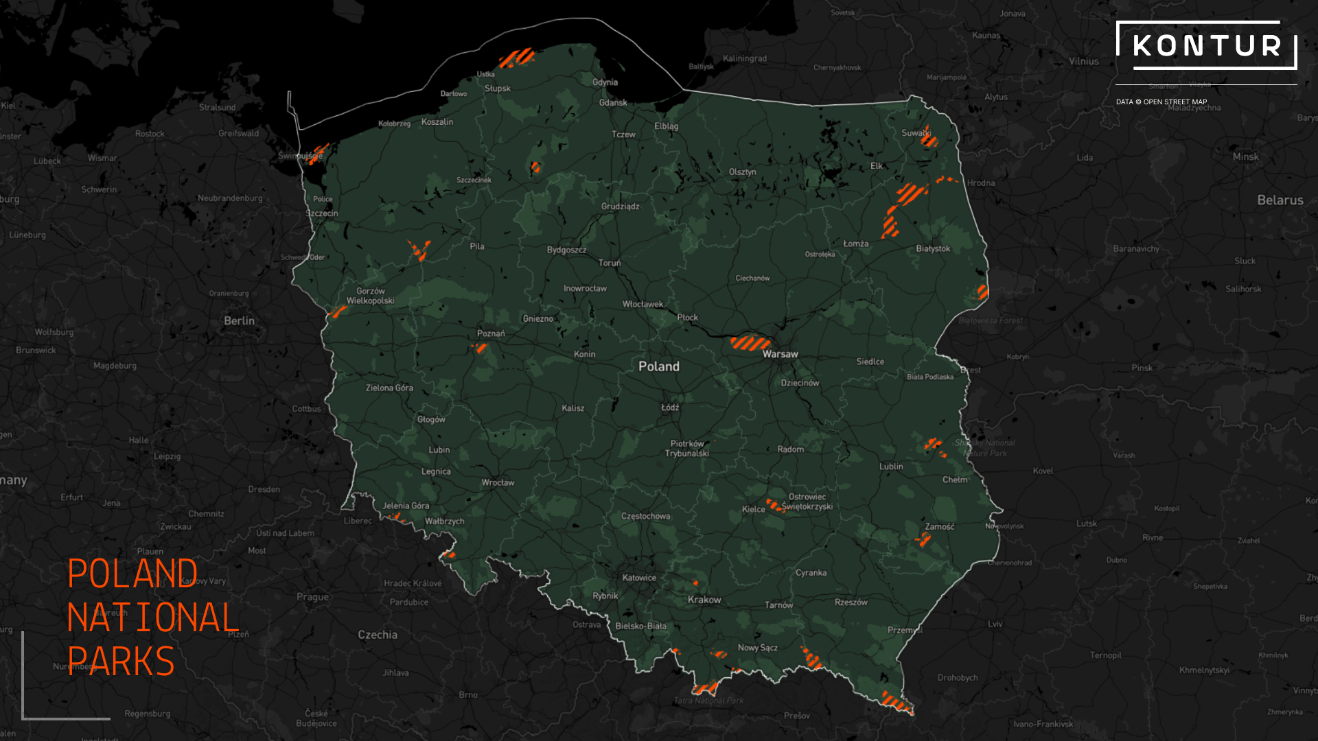
The balance between dog and cat lovers should be maintained, that’s how this map appeared. The fact that there is still a lot of space in Poland where you can walk your dogs is really nice.
https://x.com/KonturInc/status/1726618597601296713?s=20
Day 21: Raster
by Tigran Grigoryan, Front-end Engineer
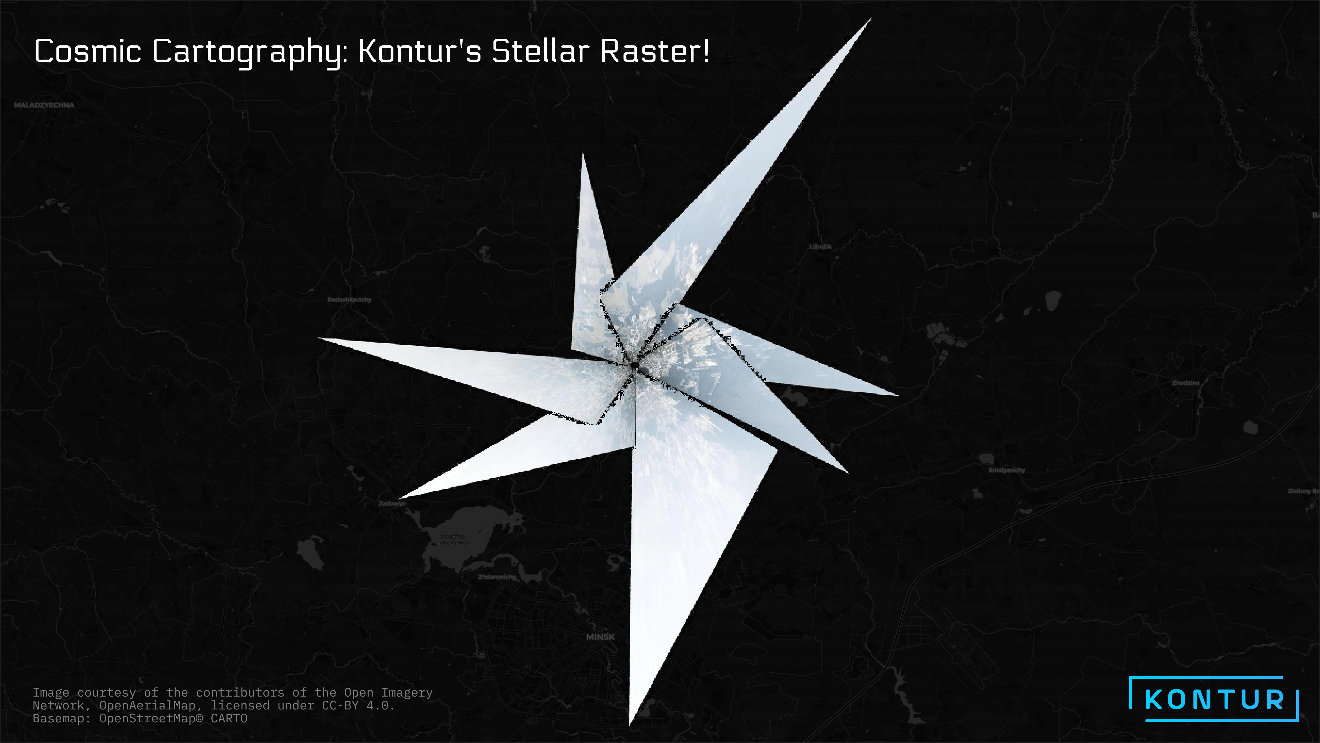
The Kontur team likes both shooting impressive abstract aerial images over Minsk and creating maps for the challenge from it.
https://x.com/KonturInc/status/1726928028112994614?s=20
Day 22: North is not always up
by Andrei Valasiuk, Geospatial Data Engineer
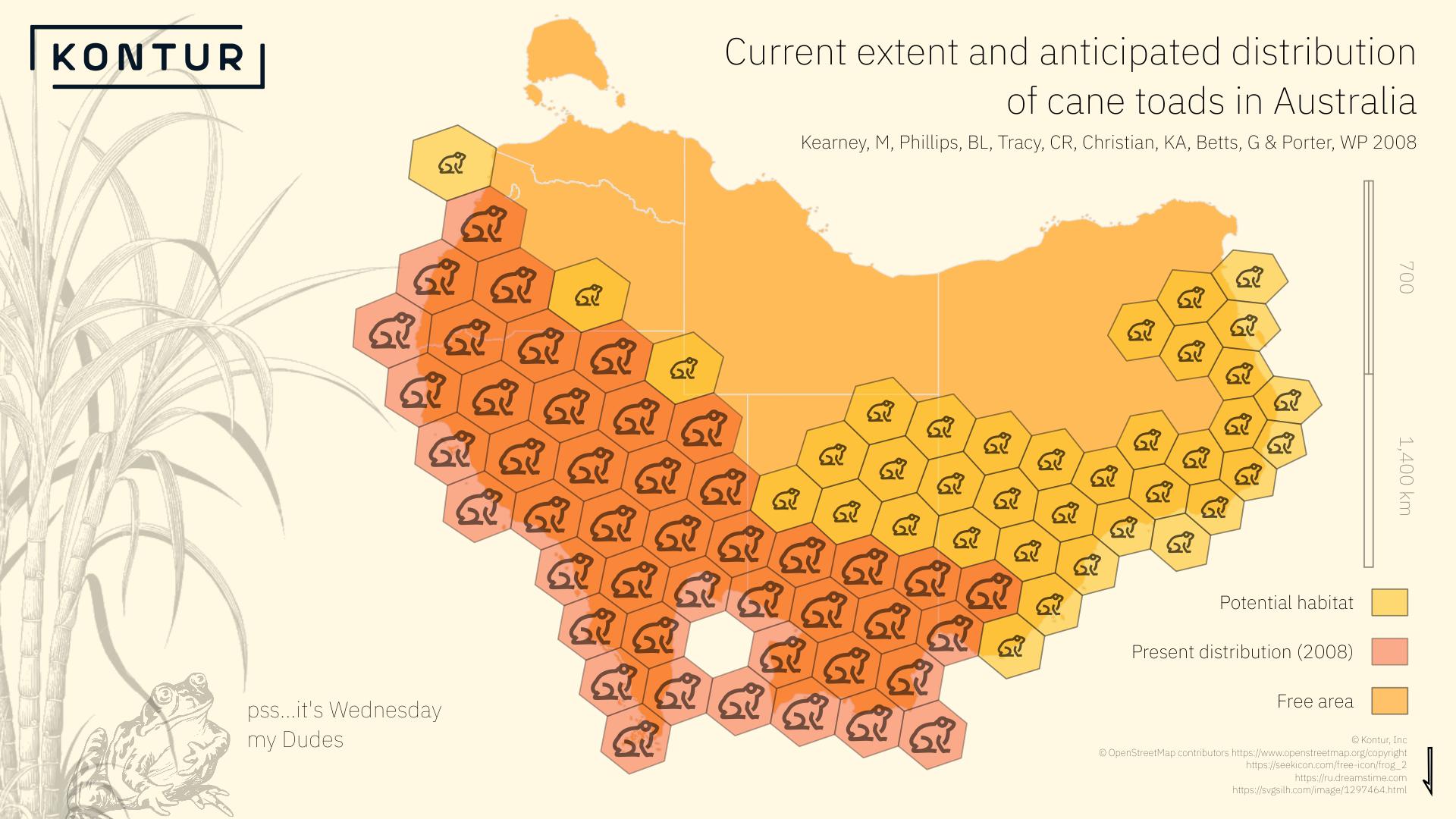
Not a typical view on Australia and its inhabitants.
https://x.com/KonturInc/status/1727299262449701107?s=20
Day 23: 3D
by Palina Krukovich, Software Engineer
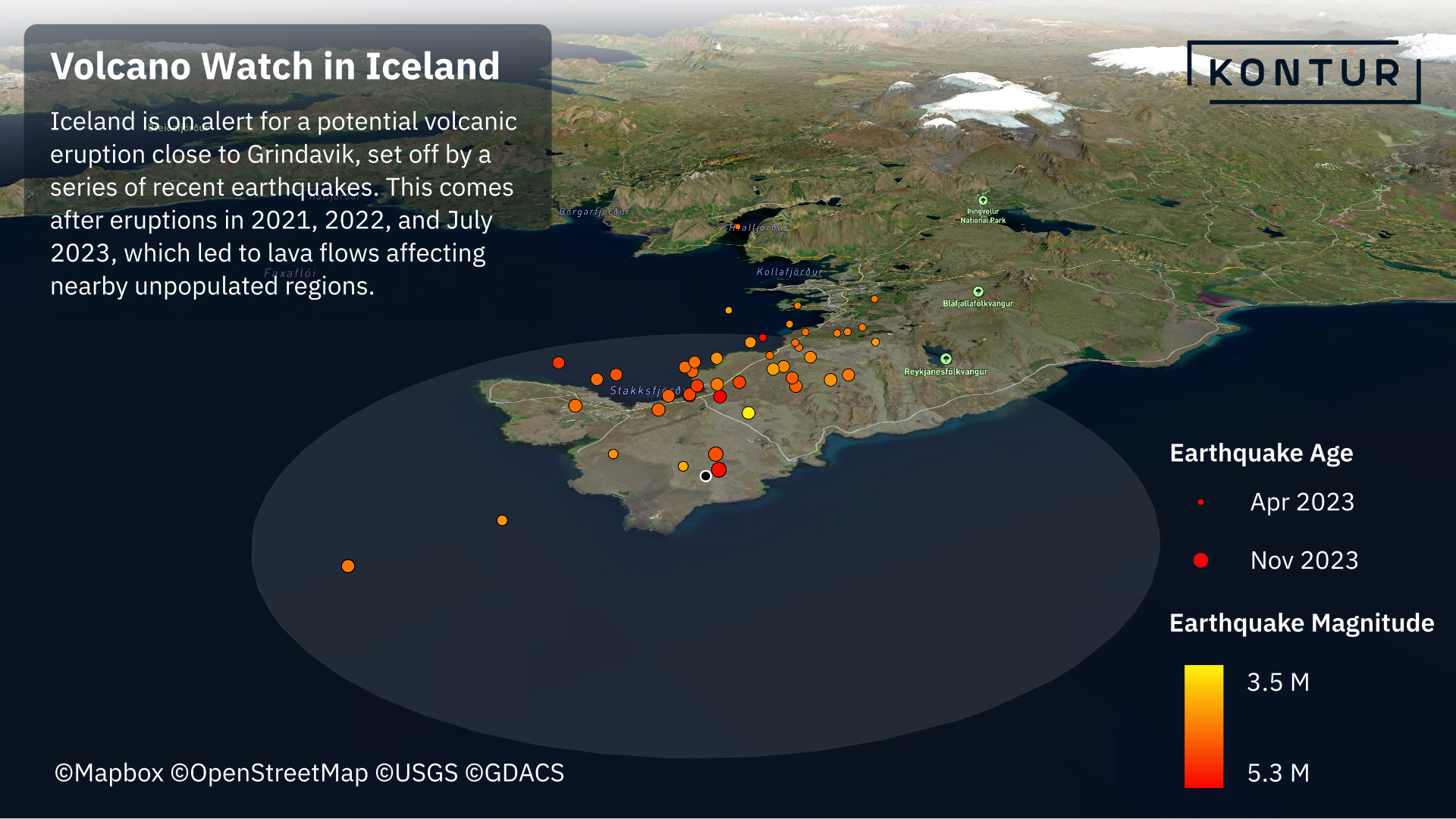
We’d heard a lot of news from Iceland in November. Who else but Kontur can visualize Event feed data and provide deep insights?
https://x.com/KonturInc/status/1727675514649776153?s=20
Day 24: Black and white
by Anastasia Artyukevich, Delivery Manager
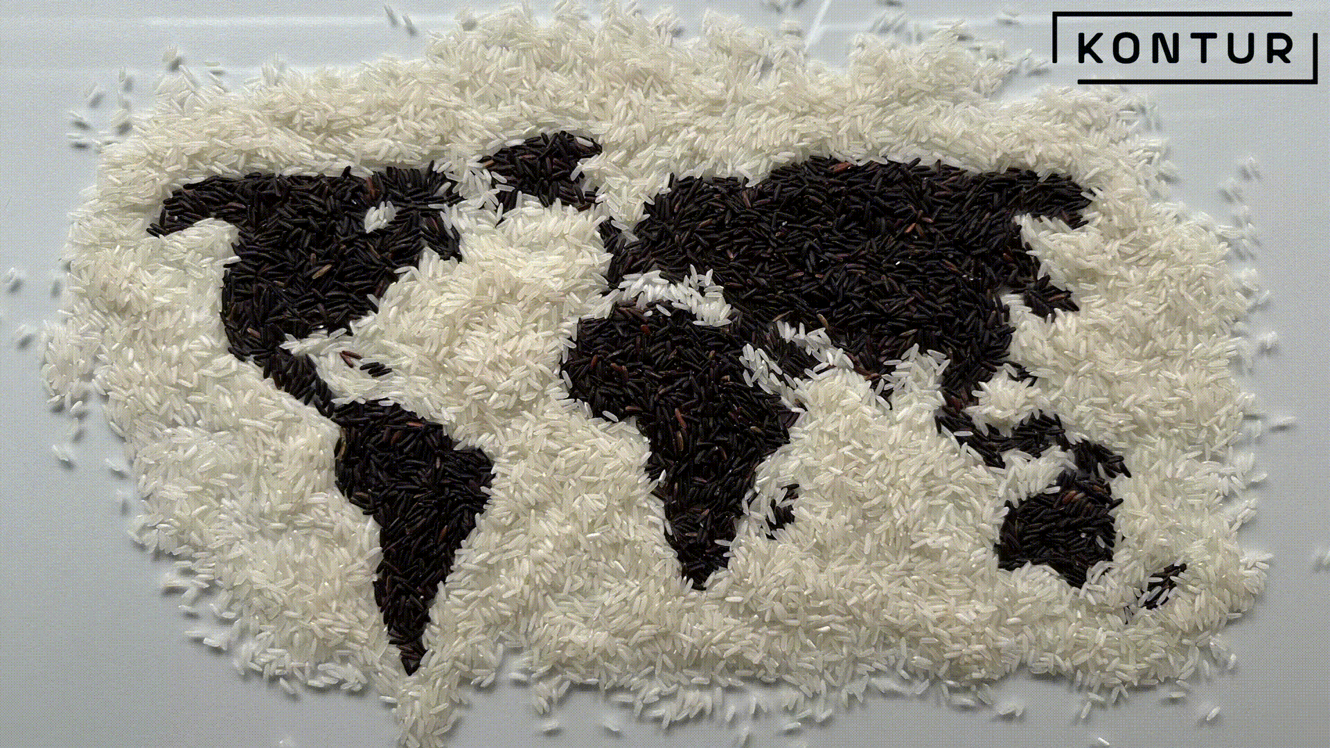
Map of the world created with black and white rice? Easy!
https://x.com/KonturInc/status/1727937592401019081?s=20
Day 25: Antarctica
by Andrei Valasiuk, Geospatial Data Engineer
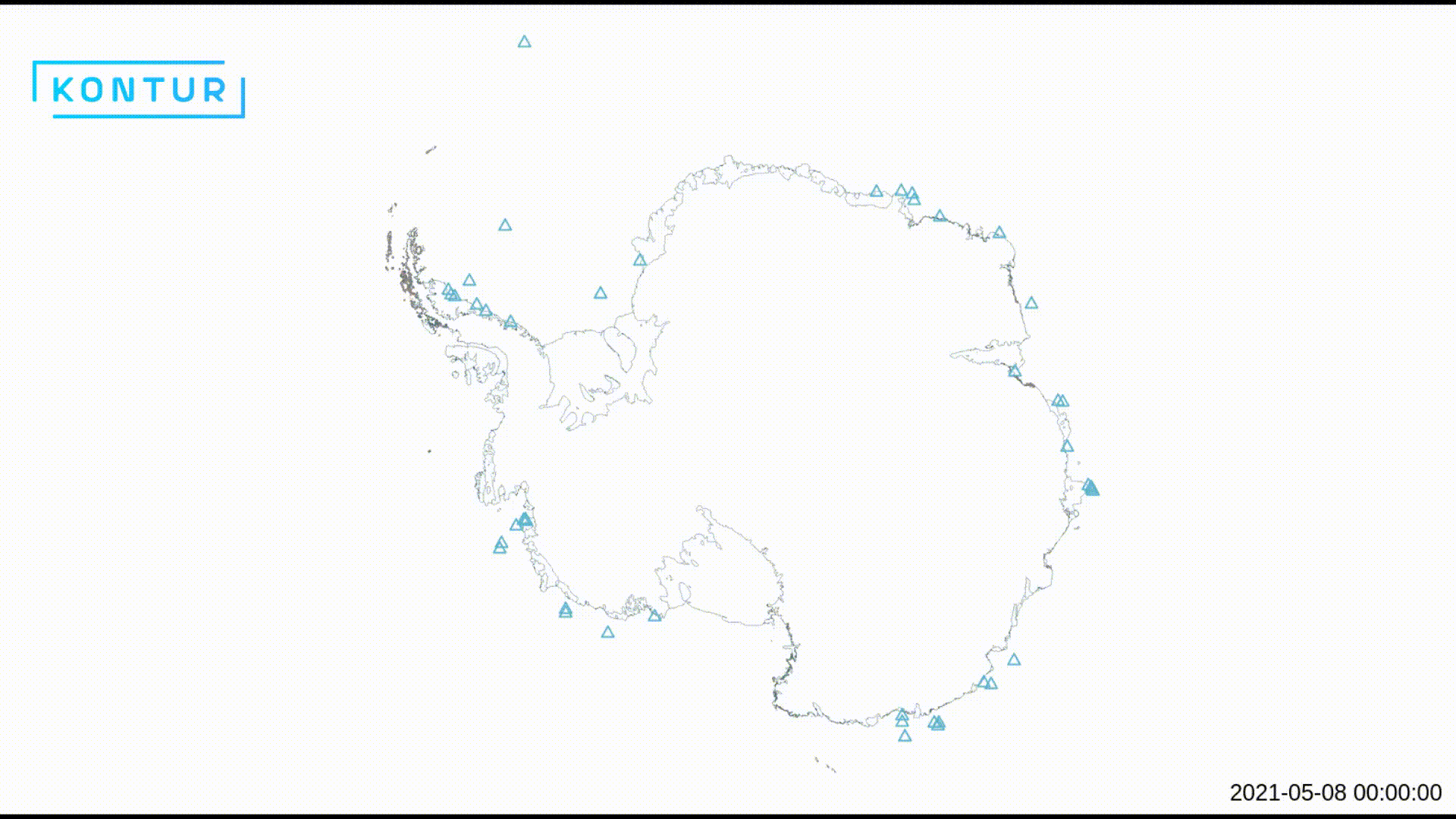
Huge iceberg A23a has broken off from the Antarctic ice shelf recently. But how did the situation look like in 2021?
https://x.com/KonturInc/status/1728359691946700970?s=20
Day 26: Minimal
by Palina Krukovich, Software Engineer
Administrative territory with the smallest population and area – it is all about the Vatican. Perfect choice for the Minimal topic.
https://x.com/KonturInc/status/1728692818967990338?s=20
Day 27: Dot
by Vasili Bondar, Administrative Director
The elections in Poland were truly intriguing this year. Colorful dots on the map are showing the distribution of votes in Warsaw.
https://x.com/KonturInc/status/1729056027495248244?s=20
Day 28: Is this a chart or a map?
by Milvari Alieva, GIS Specialist
While looking at the map that was created, we still can’t find the answer to the question in the 28th day topic.
https://x.com/KonturInc/status/1729517071262790008?s=20
Day 29: Population
by Alesia Hil, UX Designer
Small warning – close look at the map can become the reason for learning Spanish and buying airplane tickets.
https://x.com/KonturInc/status/1729772185529864319?s=20
Day 30: My favorite…
by Andrei Valasiuk. Geospatial Data Engineer
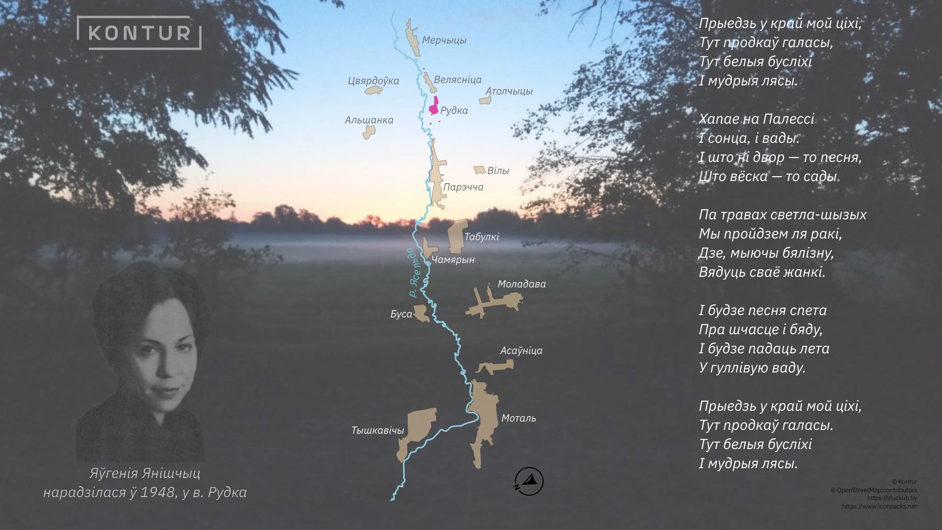
What a beautiful way to finish the 30DayMapChallenge with native language motives!
https://x.com/KonturInc/status/1730141867071672750?s=20
***
It was a great time for our team to have fun, collaborate and explore new datasets and tools. Tell us how you like our maps or don’t like them, which data sources we could miss occasionally, and subscribe to us on X and LinkedIn to see more maps and geospatial news from Kontur!
***
If you want Kontur team to make a map that will be helpful for your initiative or business, check out our solutions portfolio and contact us at hello@kontur.io.